
Creating CTA Button
A Call-to-Action (CTA) button is an essential element of an email campaign that encourages subscribers to visit a website, open social media pages, or perform another action.
Usually, the main button in an email is designed in the same style as the buttons on your website.
Creating a Button
You can add a button:
- inside an existing container, or
- in a separate email structure (see more about structures and containers).
NoteTo ensure correct display in the mobile version (for example, if block inversion is required), it is recommended to add the button inside a container.
A structure that contains only a CTA block will not change its position relative to other structures and content elements when viewed on different devices.
Button in a Container
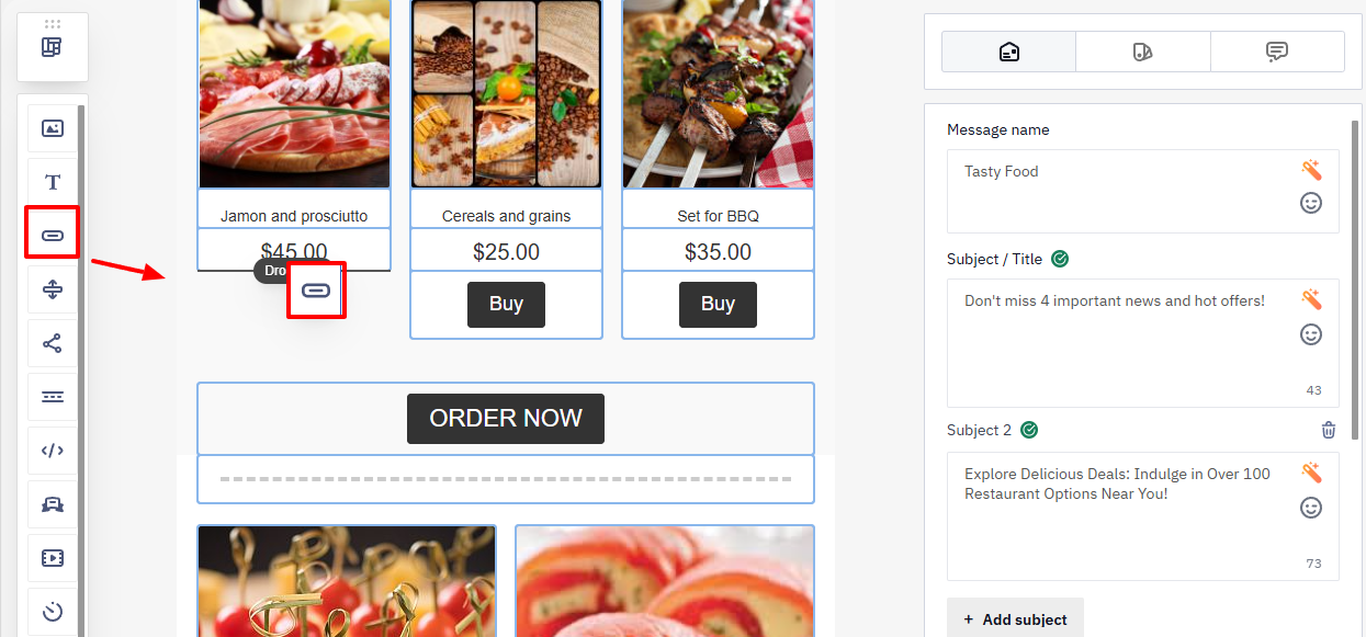
On the side Blocks panel, find the Button element and drag it into the required container of your email.
Button in a Separate Structure
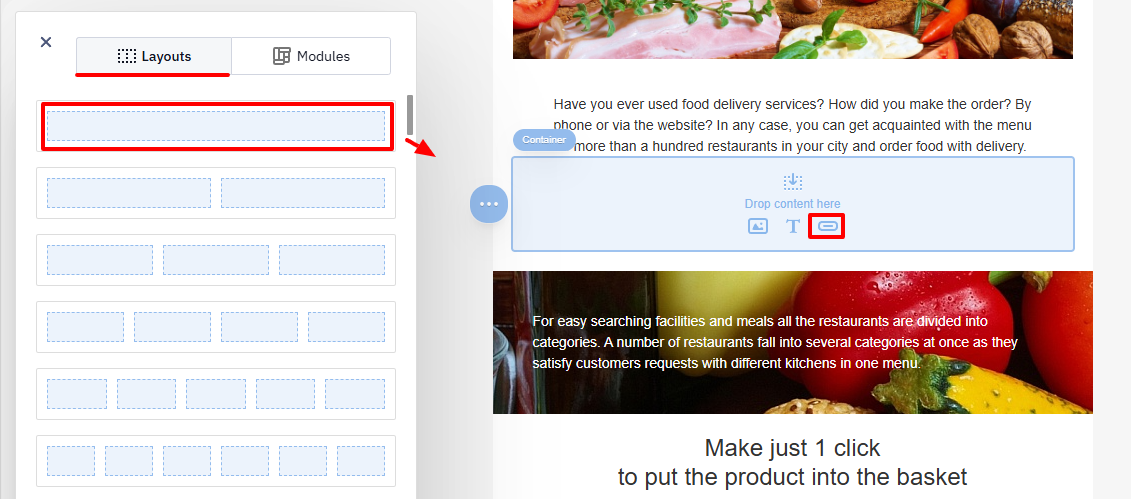
- On the side panel Structures and Modules, open the Layouts tab.
- Drag the required structure into the email area.
- After adding the structure, select the content type Button.
Configuring the Button Design
By default, a newly created button:
- does not contain a link;
- displays the text Button (Arial, 18 px);
- has a green background
#31cb4b; - uses white text
#ffffff.

You can customize the style of:
- a single button, or
- all buttons that will be created later.
Editing a Single Button
Click the button block in the template.
The editing panel will open with two tabs:
- Settings
- Styles
Settings Tab
Specify the main functional parameters of the button.
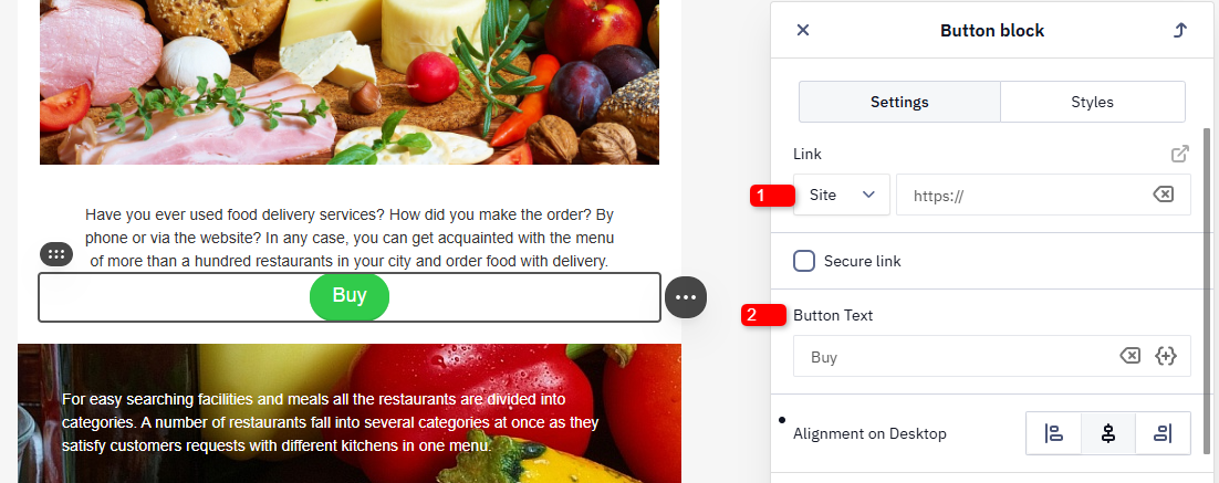
- Link — the URL that will open when the button is clicked.
- Button text — the label displayed on the button.
- Secure Link — by default, this option is unavailable. It can be enabled upon request by contacting [email protected].
This option is used when the URL contains sensitive data such as:
- contact identifiers;
- tokens;
- signed keys;
- links to personal pages or orders.
Activation is not required for regular promotional links. After enabling this feature, the Secure link checkbox will appear in the button settings.
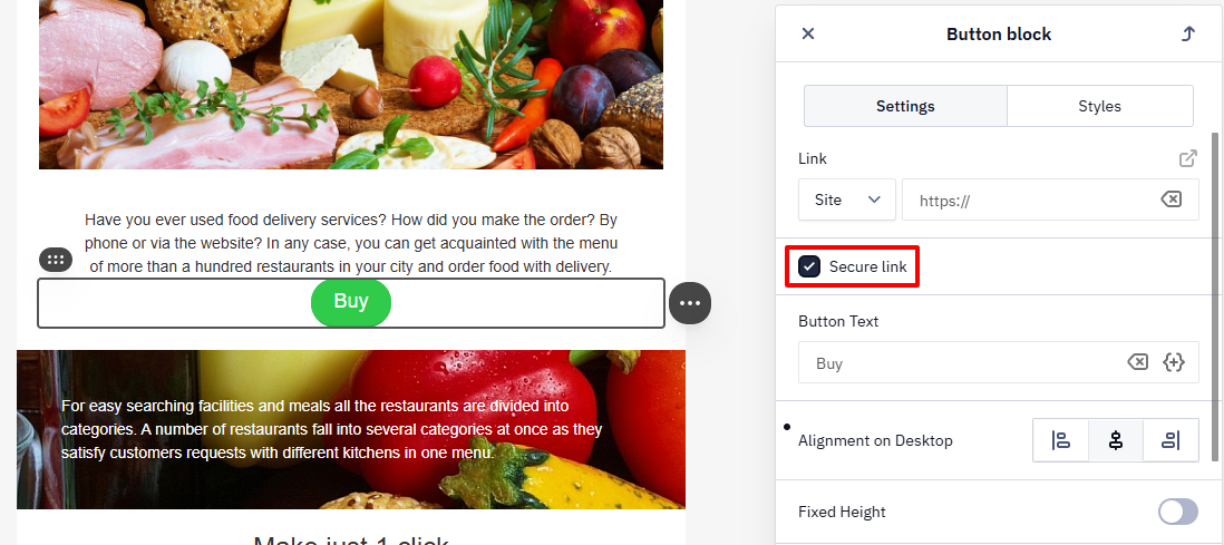
After activating the checkbox:
- the es-sl attribute is added to the
<a>tag in the email code; - during sending, the link is automatically converted into a redirect:
https://esclick.me/sl?u=target_link&iid=sent_mail_identifier&h=hash
The feature works in:
- test campaigns,
- triggered campaigns,
- broadcasts,
- browser view of the email,
- reports for individual messages.
NoteClicks on secure links are not displayed on the click map.
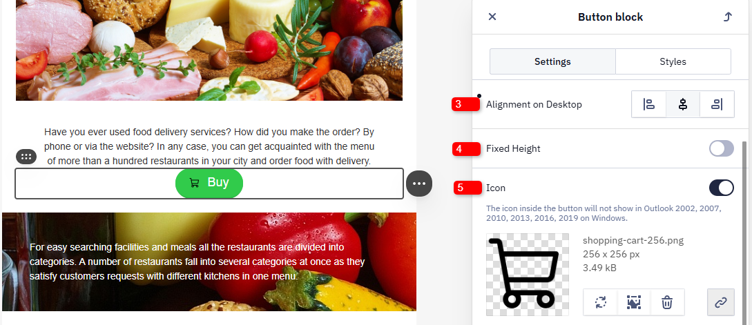
- Alignment — the position of the button in the block (left, center, or right).
- Fixed height — if enabled, the button height will not change depending on the device type.
- Icon — adds an image icon displayed inside the button (for example, a cart or arrow icon).
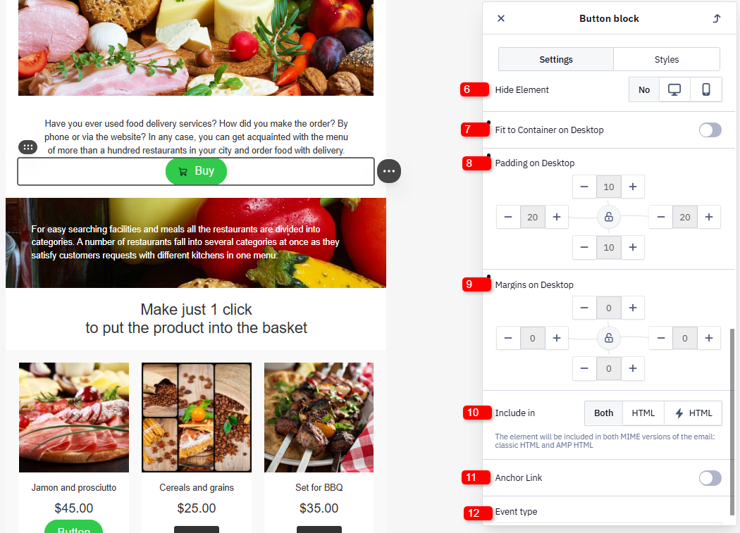
- Hide element — enables hiding the button in the desktop or mobile version of the email.
- Fit to container — if enabled, the button will occupy the full width of its container in the desktop version.
- Padding — the distance between the button borders and the block boundaries.
- Margins — the distance between the button and other elements in the desktop version of the email.
- Include in — select the email versions in which this button will be displayed (HTML and/or AMP).
- Anchor link — moves the reader to a specific part of the email without scrolling. This simplifies navigation.
- Event type — used for automation. For example, you can specify an event triggered when the button is clicked to send additional emails automatically.
Link Types in a Button
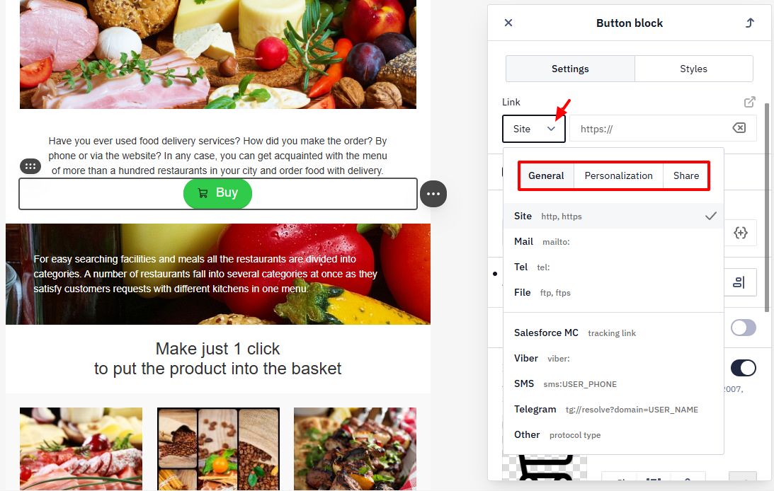
In the button settings, you can select the link type. This determines where the user will be redirected after clicking.
- General: Site, Mail, Tel, File, Calendar Event Link, Salesforce MC, Viber, Sms, Telegram, Other.
- Personalization: the Special links group — Unsubscribe, View in browser, Subscription confirmation.
- Share (social media): Facebook, X, LinkedIn, Pinterest.
Styles Tab
This tab allows you to configure the visual appearance of the button.
- Button color — background color of the button.
- Font family — the font and formatting of the button text.
- Font size — the size of the button text (in px).
- Font weight.
- Text style and font color — formatting (for example, bold or italic) and color of the button text.
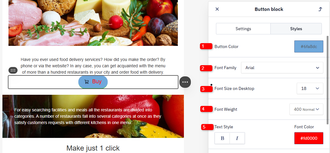
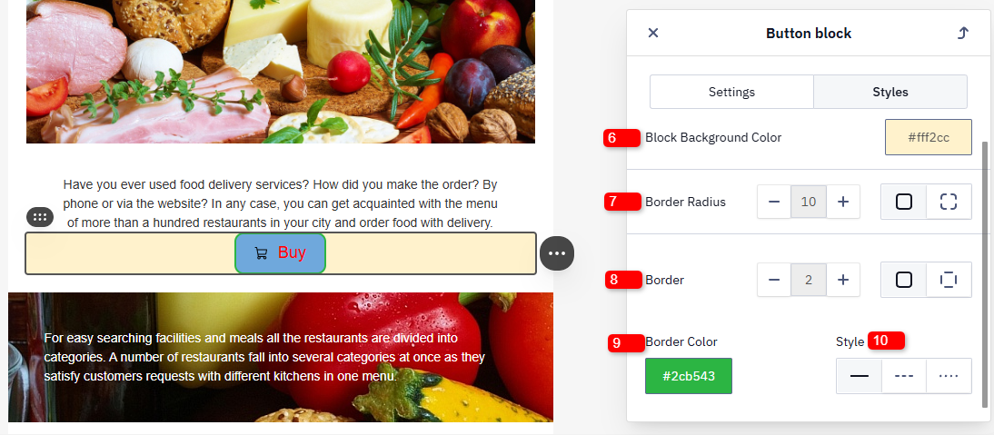
- Block background color — the background color of the container (block) that contains the button.
- Border radius — the corner rounding radius of the button.
ImportantTo ensure rounded corners display correctly in Outlook, enable the Outlook support option in the global style settings (Button tab). Even with it enabled, desktop Outlook can squeeze the button, alter its background color, or add unwanted borders, since it renders buttons with its own VML-based engine rather than standard HTML/CSS. Preview and test buttons in Outlook before sending.
- Border — the thickness of the button border.
- Border color — the color of the border.
- Style — the border line style (solid, dashed, etc.).
Saving the Button to the Module Library
NoteIf you export a message as an .oft file for Outlook and then change a button's link directly inside the exported file, the change won't apply after sending. The Support of Outlook option inserts VML code into the button's HTML, and editing the link outside the editor breaks that code. Set the final link in the editor before exporting, or turn off Support of Outlook if you need to edit links in the exported file — keeping in mind this can distort the button's appearance in Outlook.
If you plan to reuse the created button in other emails, save it to the Module Library. This allows you to quickly add the styled button to new templates without configuring it again.
Editing All Buttons
By default, the appearance of buttons is determined by the styles defined in the email template. To change their design, edit the style settings in the global template. After that, all new buttons added to the email will automatically inherit the updated design.
Learn more about configuring button styles for the entire email >
Updated 10 days ago