
Setting up Widgets for Your Site
Place different widget types on your site to improve visitor interaction and collect more contact data.
To publish widgets, install our script before the closing body tag on every website page. To get a script, go to Site → Widgets, click the Get script button (available after creating your first widget), and specify your site's domain.
More about getting and installing web tracking script >
NoteThe widget script is generated per site domain, and one account doesn't support configuring separate subscribe widgets for multiple domains. If you need a subscribe widget on a second domain, we recommend using a separate account for it.
- If you load the script with a delay instead of immediately after the page loads, the display immediately condition won't trigger on the actual page load — it fires only once the delayed script initializes. Other display conditions are not affected.
- Widget form content is visible to and can be indexed by search engine crawlers like Googlebot.

After installing the script, proceed to widget creation. All widget types have similar settings.
To personalize widgets, use Merge Tags or prefill form fields with URL query parameters, JavaScript variables, Local storage, cookies, or Data layer events. In multi-step widgets, add branches to direct users to different pages based on their responses.
Select the widget type from the left menu or the drop-down list.
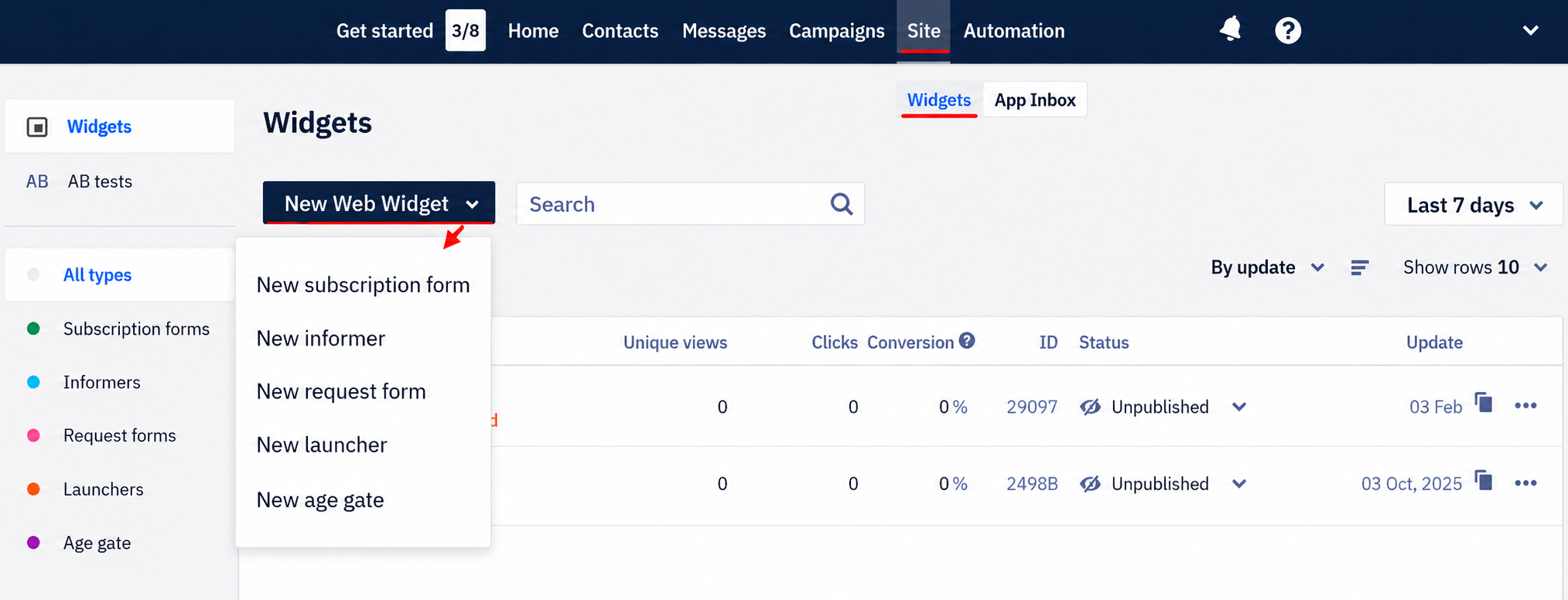
Appearance
Start widget creation with initial settings.
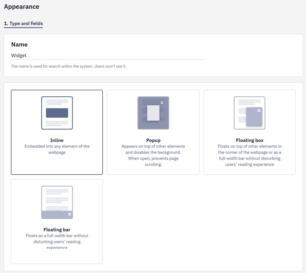
1. Name / Type and Fields
1.1. Fill in the Name field. The name is used for search within the system. Users won't see it.
1.2. For subscription forms and informers, select the type from the available options:
- Inline — embedded into any element of the webpage
- Popup — appears on top of other elements and disables the background. When open, it prevents page scrolling.
- Floating box — floats on top of other elements in the corner of the webpage or as a full-width bar without disturbing users’ reading experience.
- Floating bar — floats as a full-width bar without disturbing users’ reading experience.
NoteA Popup closes when the visitor presses and releases the mouse button on the shaded backdrop around the widget. If the press starts on the widget content and ends on the backdrop — for example, while selecting text in a field — the popup stays open. The Esc key and the close button always work.
If the widget has to stay open until the visitor closes it or submits the form, use Floating box or Floating bar instead.
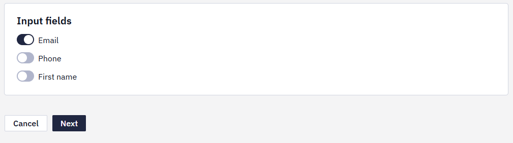
1.3. For subscription forms, activate the widget’s input fields.
1.4. Click the Next button.
2. Style (Skipped for Launchers)
2.1. To create a widget based on your website style, select colors and style. The system will generate a widget based on your settings.
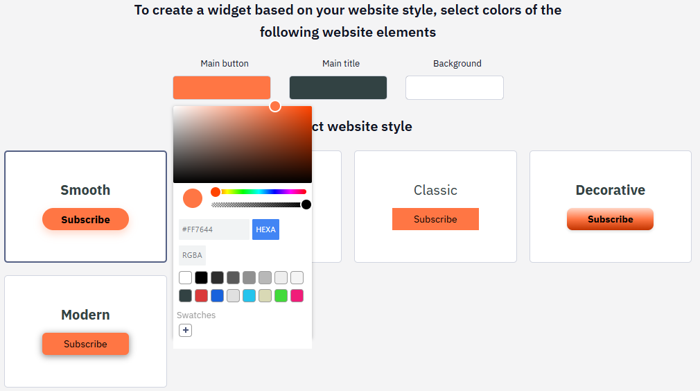
2.2. Click Next.
3. Select Appearance
Select the appearance style for the element. Each widget type has different options.
Select the most appropriate option. You’ll be able to edit it as needed.
Widget Editor
You have various tools to customize the widget’s style and elements.
Basic Actions
The widget structure has 3 levels:
- State.
- Container (for some types of widgets).
- Element.
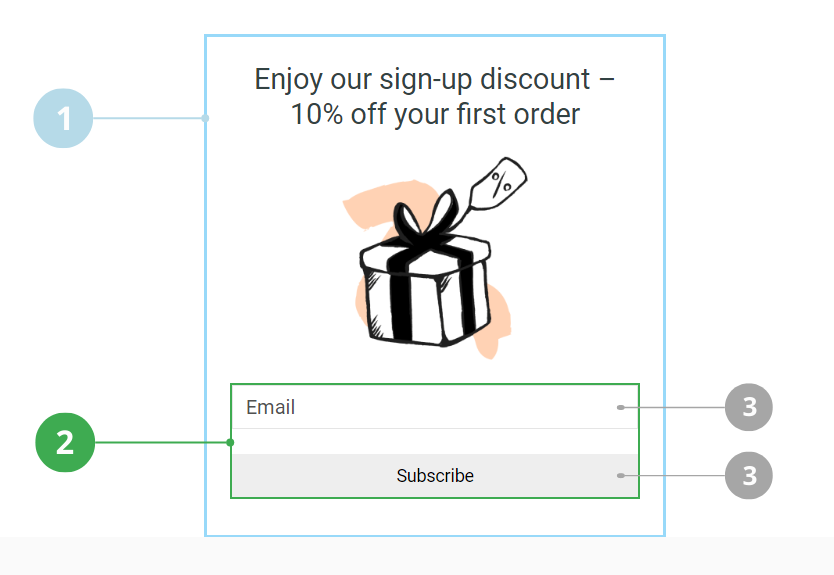
When you click the right mouse button on the widget element, the following basic actions become available:
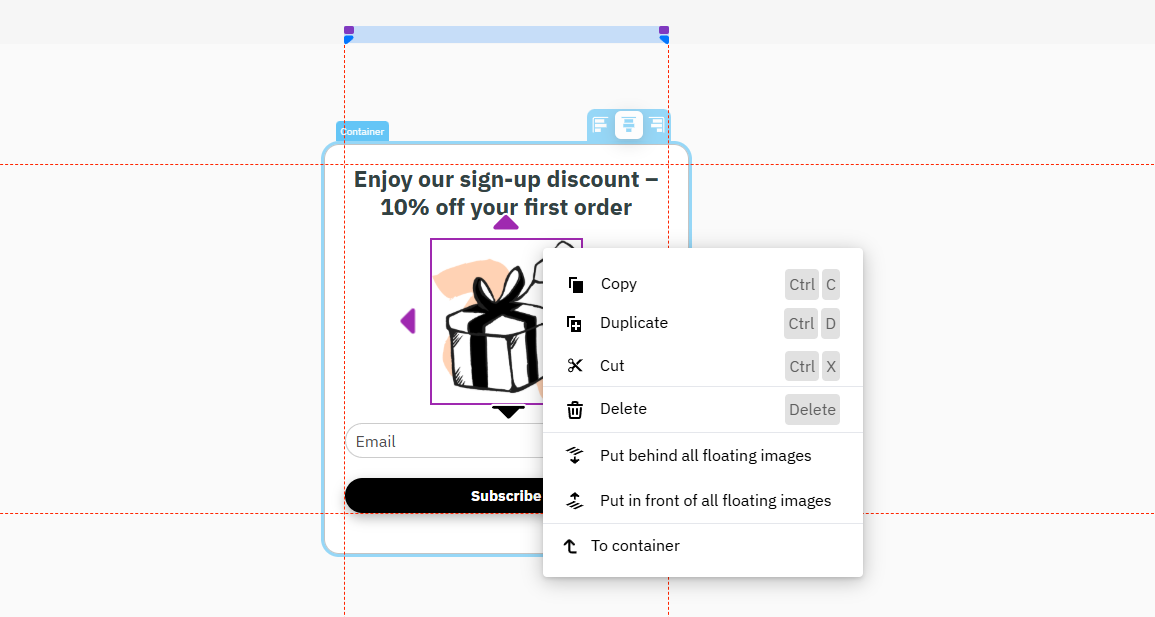
- Copy
- Duplicate
- Cut
- Delete
- Put behind all floating elements
- Put in front of all floating images
- To container
Top Panel
The top panel menu contains buttons with the following functions:

- Switch to the desktop/mobile version.
- Undo/Redo
- Multilanguage settings:
- Form appearance is set up only in the version with the default language. Then it's automatically applied to other language versions.
- In other language versions, you can only change the text.
- The form is displayed in the site language: first the
langattribute in thehtmltag is used, then the language code in the page URL, and if neither is present, the visitor's browser language.
- Widget preview.
- Close without saving.
- Save button.
Left Panel
On the left side of the screen, you can find the components of the widget you are creating. The editor works as a drag-n-drop constructor. If you need to add any element, left-click on it and drag it to the appropriate place of the widget.
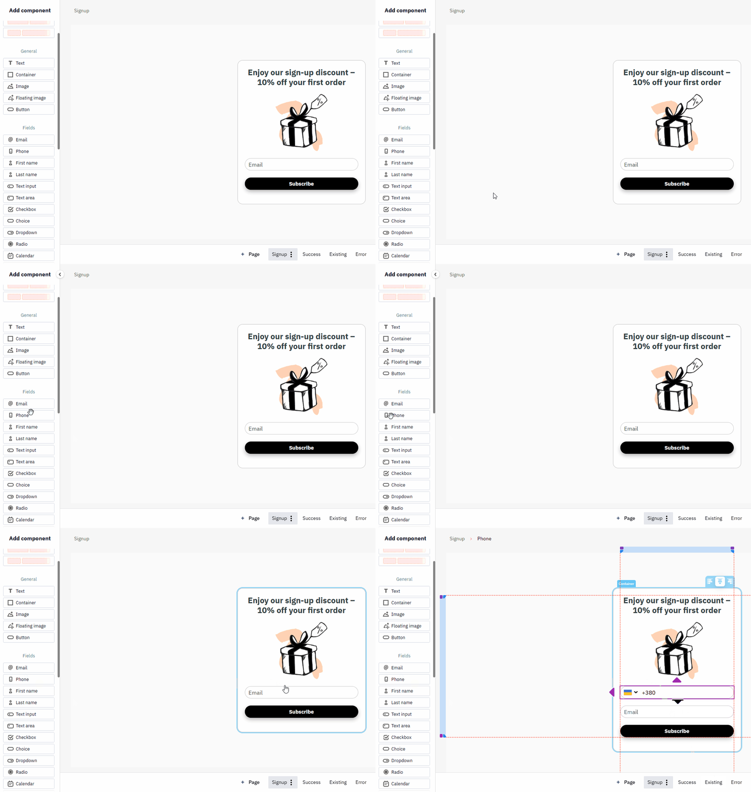
The NPS/Rating and gamified components described in the separate articles.
Right Panel
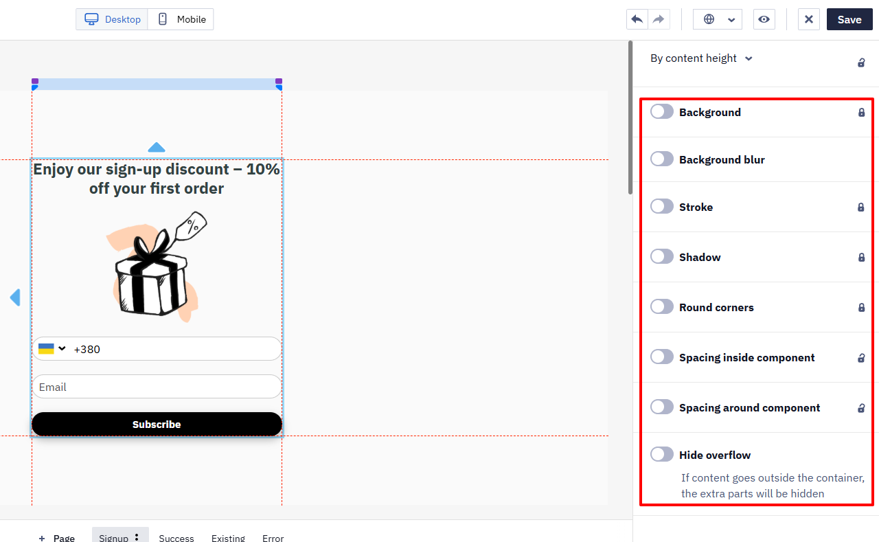
When you don't have any widget items selected, you will see design settings on the right side of the screen. These settings apply to the entire widget:
- Align inner elements
- Distance between elements
- Size
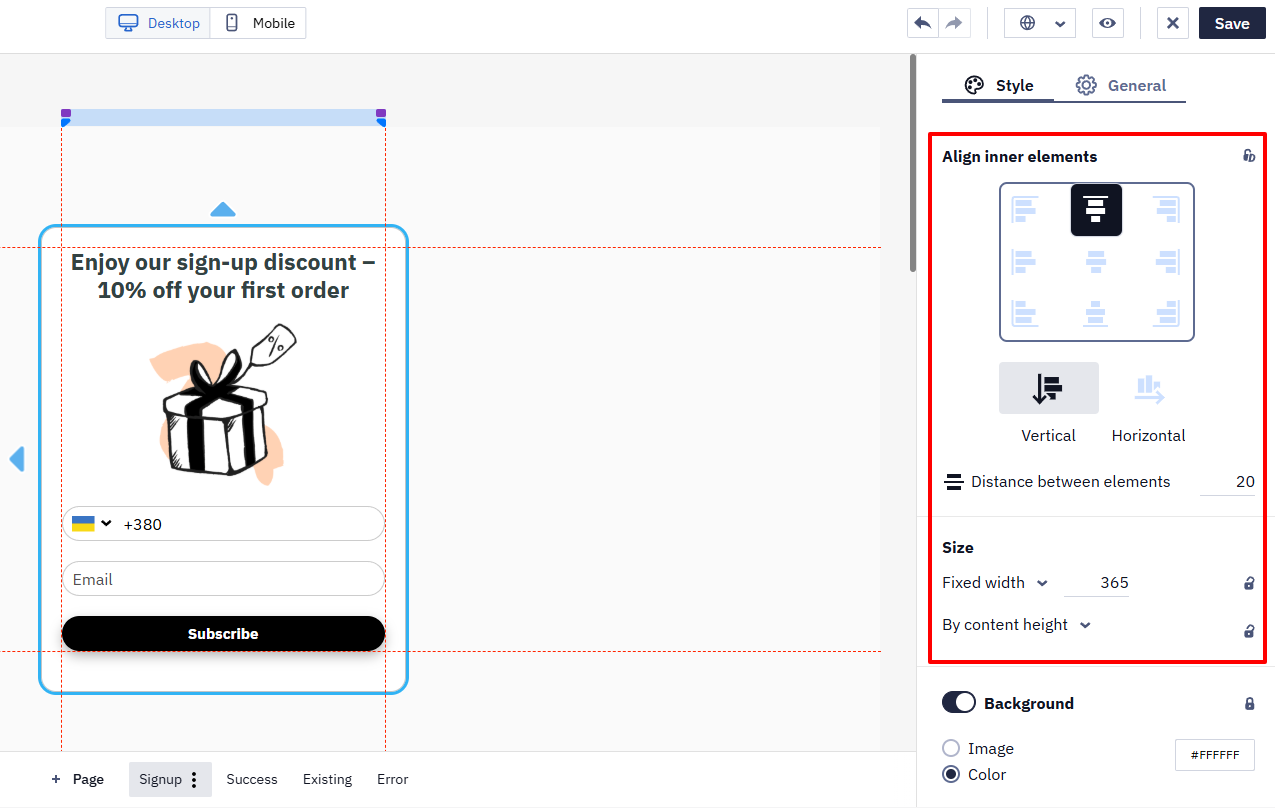
- Background
- Stroke
- Shadow
- Round corners
- Spacing inside component
- Spacing around component
- Breakpoint
Launcher settings:
- Action on click
- Positioning
- Entry animation
- Loop animation
- Z-Index
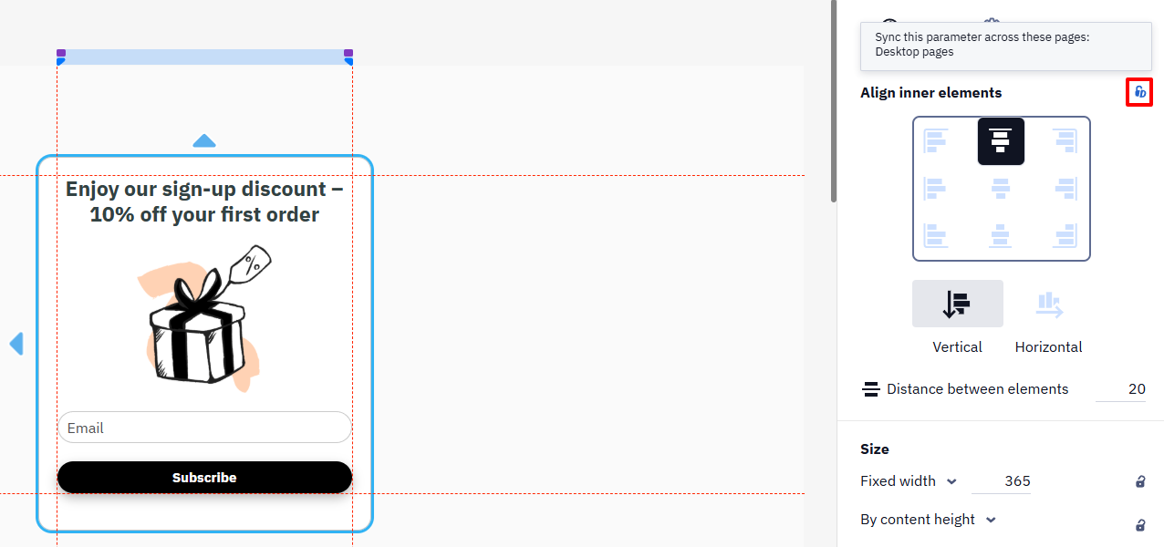
Settings marked with a lock icon sync parameters across pages. You can change the synchronization setting by clicking the icon and selecting the needed option.
Editing Widget Elements
If you want to edit individual widget elements, just click on the desired element.
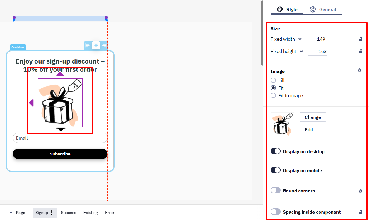
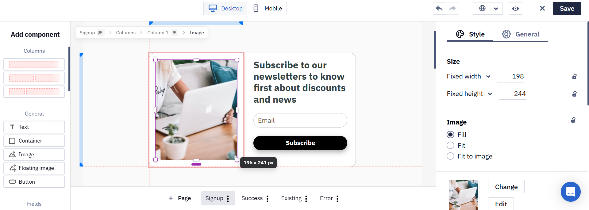
You can resize a component right in the editor. Select it and drag a corner to change the width and the height together and keep the proportions, or drag the middle of a side to change one dimension. The current size in pixels is shown while you drag. For exact values, use the Fixed width and Fixed height fields in the Size section of the Style tab.
Text Settings
Select a text element to open its settings on the right panel.
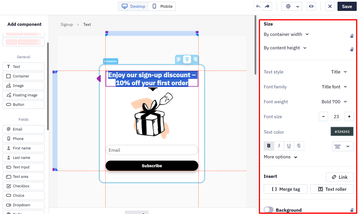
By default, text has the same formatting in the desktop and mobile versions of a widget. To make the text look different on mobile devices:
- Switch to the mobile version using the toggle on the top panel.
- Select the text element.
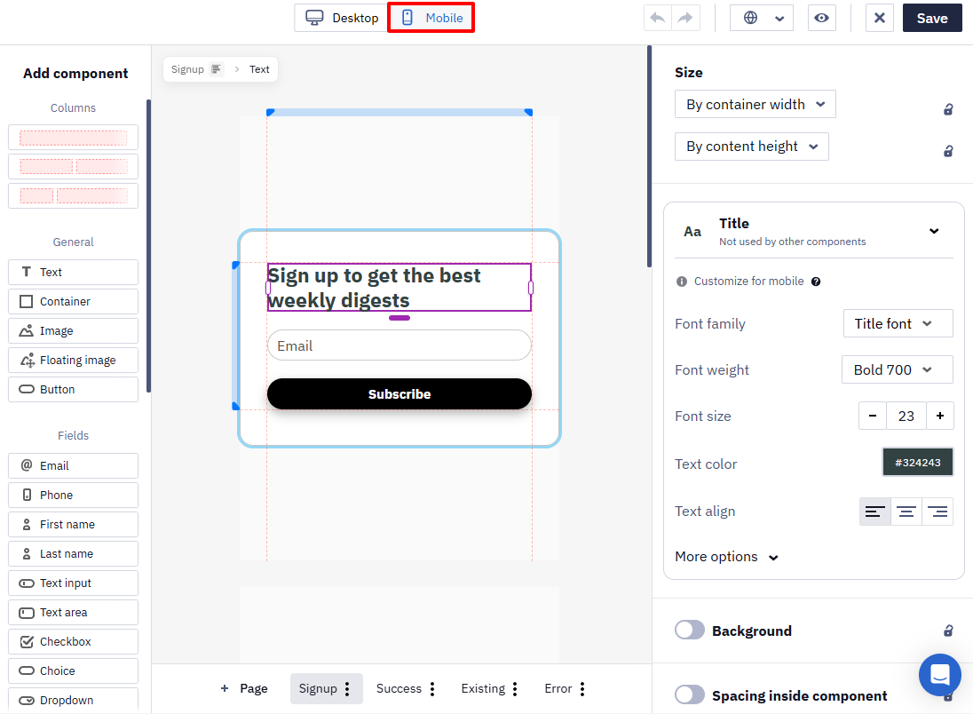
- Change the required properties, such as the font size or text color.
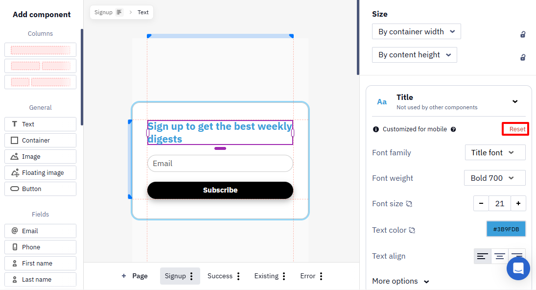
After you change that property no longer follows changes made in the desktop version.
To restore the desktop formatting for the changed properties, click Reset. These properties will synchronize with the desktop version again.
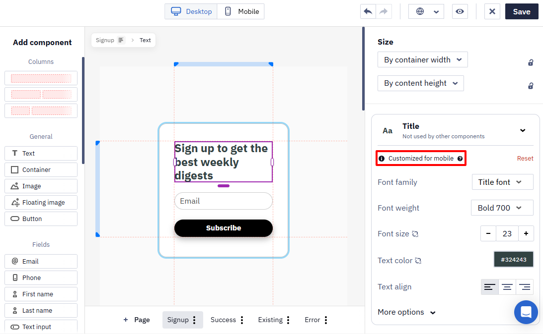
If text in an existing widget was configured differently for desktop and mobile devices, the editor displays the Different style on mobile notification.
To change the color of an individual word, phrase, or character, select the required fragment directly in the text element and choose a color from the inline formatting toolbar. The color is applied only to the selected fragment, not to the entire text element.
- By default, widgets use the primary font set on your website.
- If this automatic detection doesn't pick up the correct font, you can set it manually: right-click the text on your site and select Inspect to open the browser's developer tools, filter the Styles panel for
font-family, copy the value of the active (non-crossed-out) declaration, and paste it into the widget's Title font or Text font field. The pasted value applies to all widget text using the corresponding font option. - The widget only loads Google Fonts that are actually used in the widget's content — fonts referenced in unused styles or classes are not loaded.
- The Text roller element animates scrolling text, helping attract attention and display more information in a compact format.
- Merge Tags personalize widget text with website data.
Image Customization
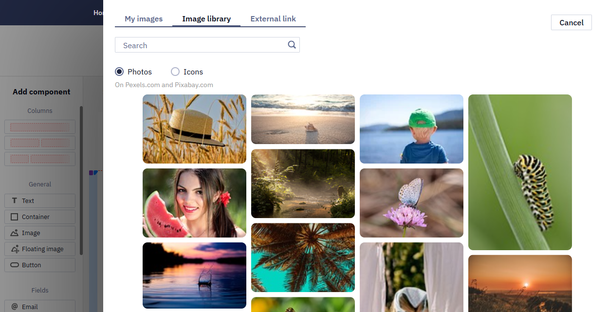
To open image style settings, left-click on the image. You can upload your picture, choose a suitable one from the library of free photos and icons, or enter the URL of the image you want to embed. External URL allows you to keep the referenced sources up-to-date. For example, promo actions or products on a site.
Upload images in PNG, JPEG, SVG, GIF formats, up to 3 MB
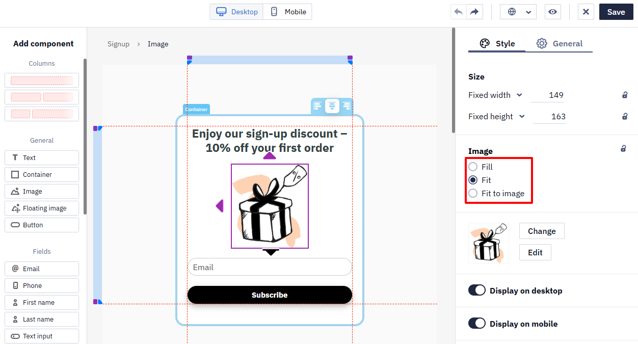
In addition to the standard settings, positioning customization is also available for images:
- Fill,
- Fit,
- Fit to image.
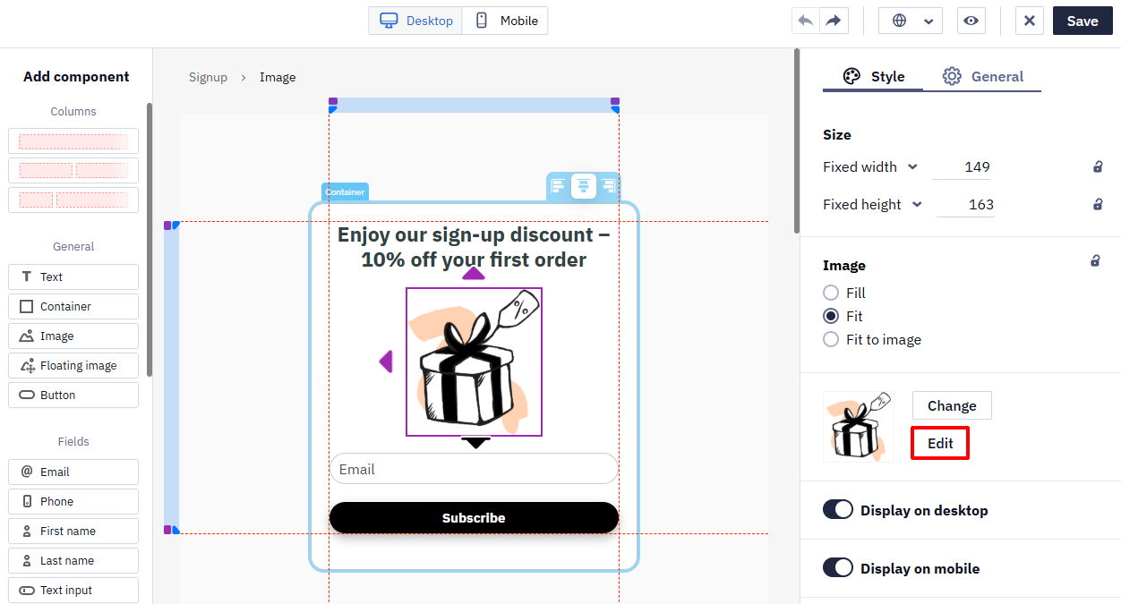
You can edit the image directly in the editor when uploading (if it does not meet the requirements) or after uploading (the Edit button). After editing, the image is saved in PNG format.
For a custom-designed Informer built around a full background image, a wide desktop image may get cropped or hard to read once it's resized for mobile. To use a different image on mobile, switch to the mobile view in the top panel, click the lock icon next to the Background setting, select Do not sync, and upload a separate image — the desktop and mobile versions will then use different images without affecting each other. Square or vertical images usually adapt best to both screen sizes.
Slider Settings
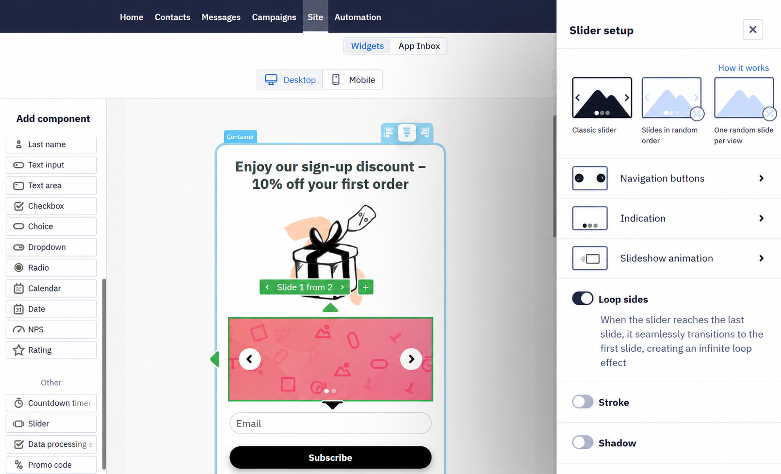
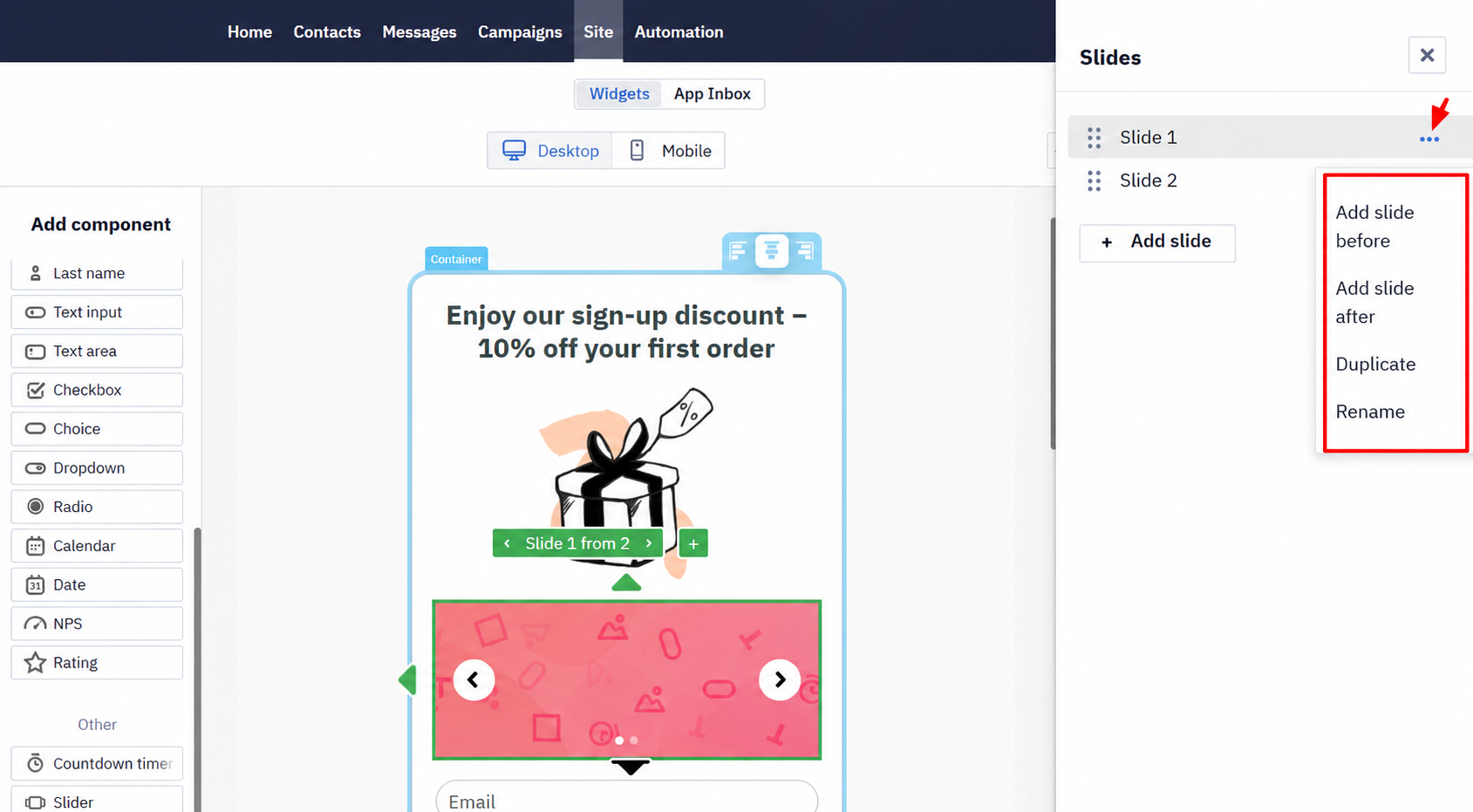
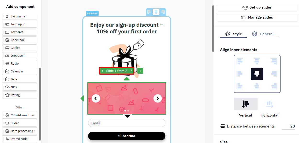
Drag the slider from the left-side panel and drop it into the widget’s template. Set up slider and Manage slides buttons will appear on the right-side panel.
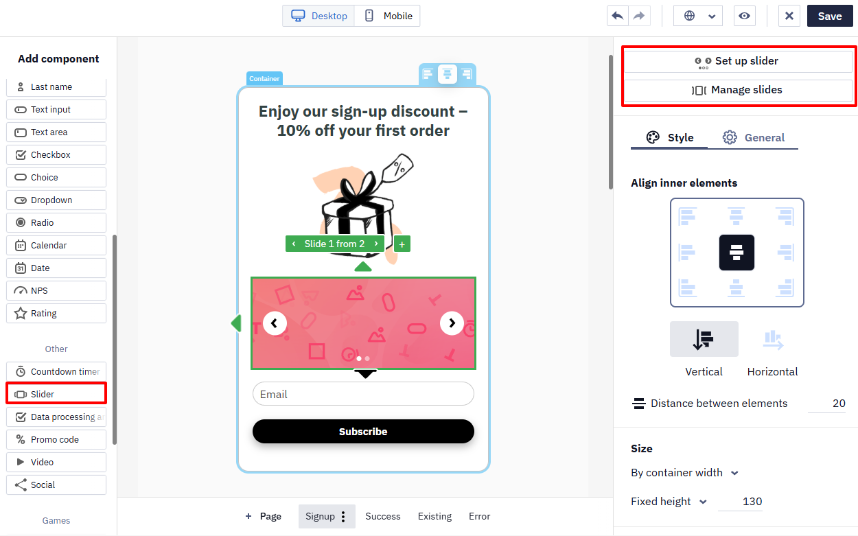
- Set up navigation buttons, indication, slideshow animation, and general slider’s design in the Slider setup window.
- Manage slides’ order, add, duplicate, or rename slides after clicking the Mange slides button.
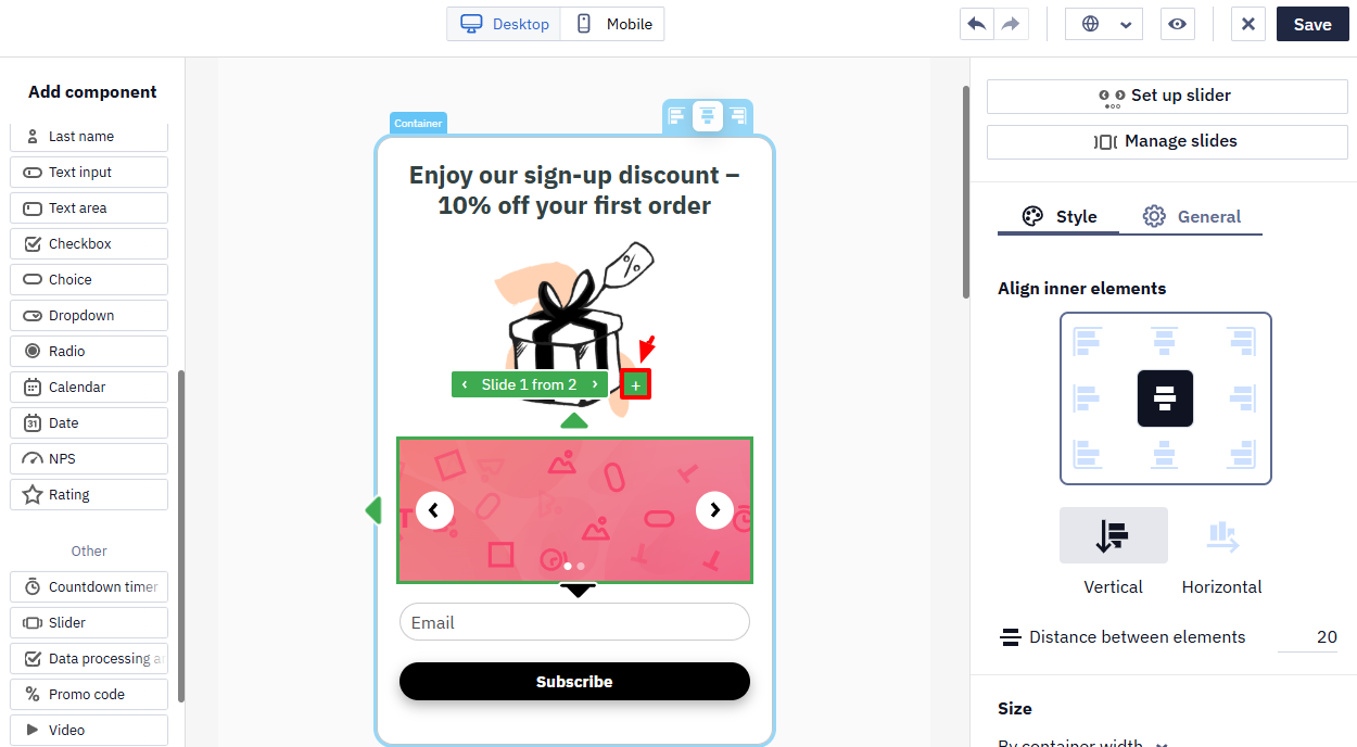
Also, you can add a slide by clicking on the + sign.
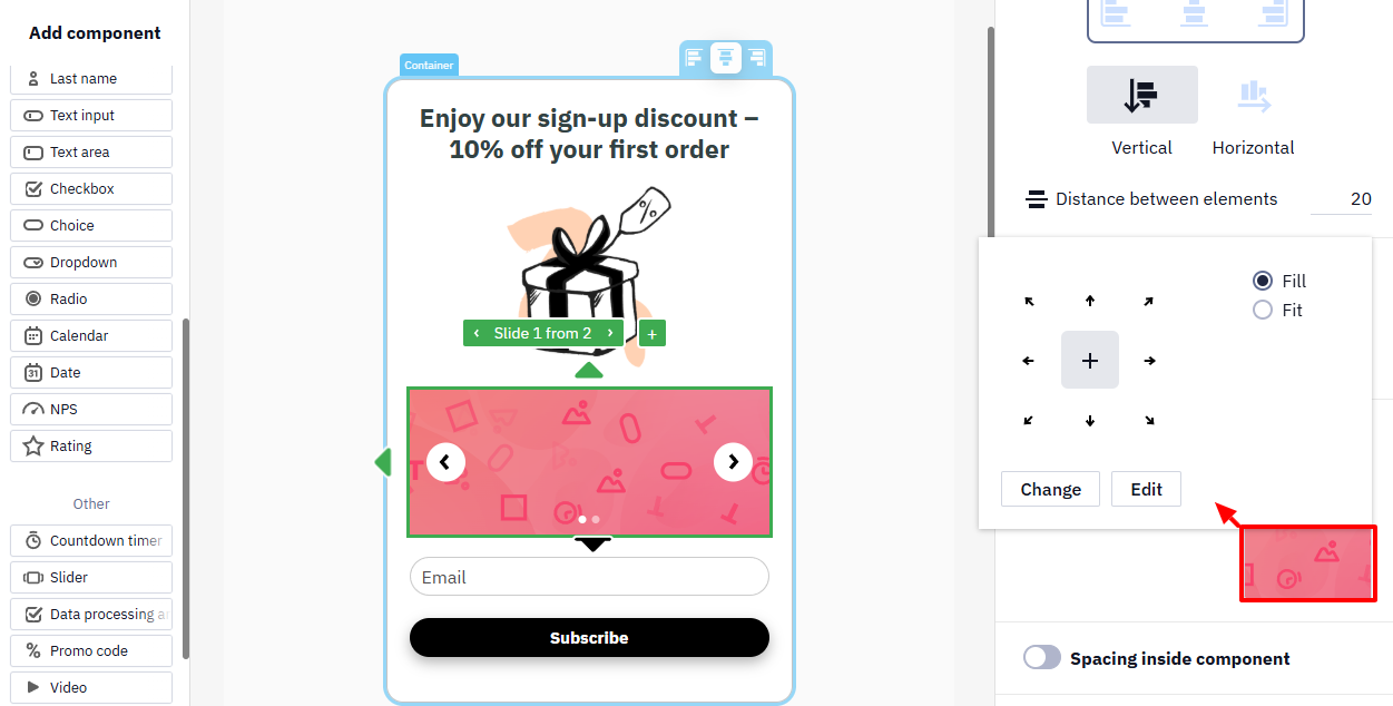
To change or edit an image, click on it in the template, after which it will appear in the right settings panel. Clicking on the image from the slider in the settings panel opens the editing and editing window.
Use navigation buttons to switch between the slider’s images.
Close Button
Click the widget's close button to open its settings on the right panel: pick a more or less visible design, set the icon's color and opacity, adjust its size (particularly useful to make it easier to tap on mobile), and place it inside, centered on, or outside the widget's edge. A Custom tab lets you upload your own close icon instead of the default one.
The close button can't be fully hidden on standard widgets — this is intentional, so visitors always keep control over closing the widget.
General Tab
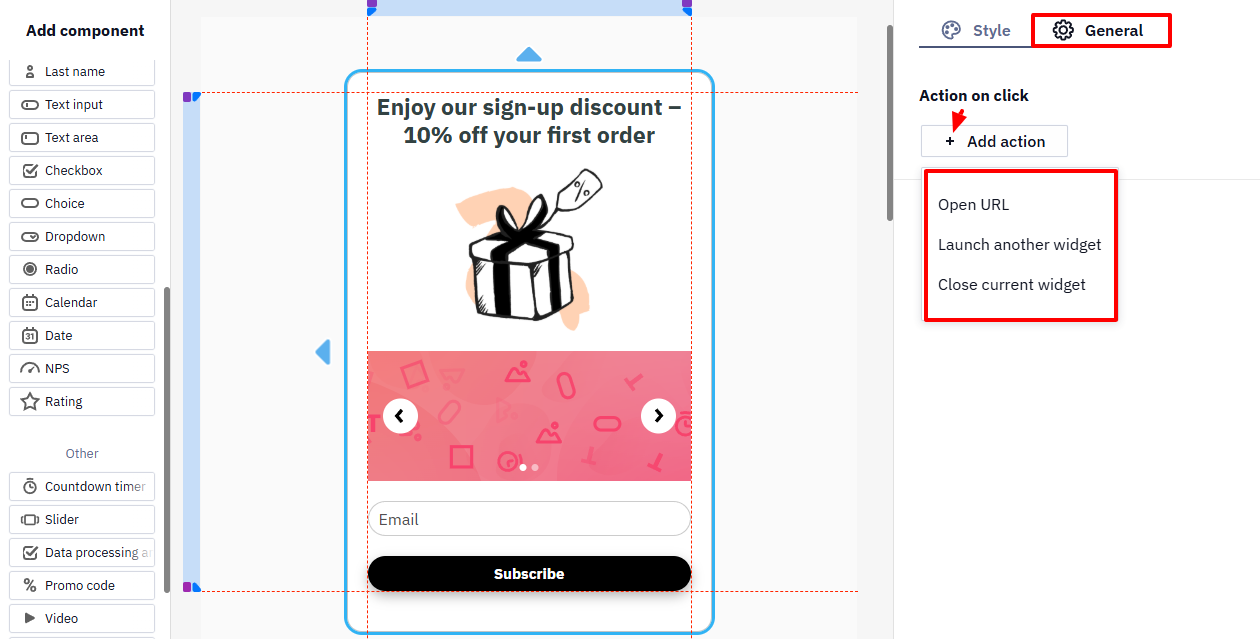
Click on the widget's element to see the General tab with such settings:
- Action on click
For a button in a widget with any game component, the game start action (Run the game) is available. For details, see Running the Game with a Button.
Moving Between Widget Pages
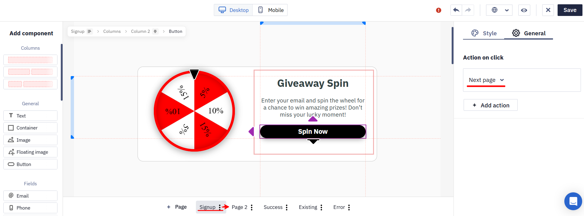
In a multi-page widget, a button can send the visitor to another page, so the path through the widget can depend on what the visitor does — for example, a bigger discount after they decline the first offer.
The action name shows the button's role in that path: on intermediate pages it is Next page, and on the step where the form data is actually sent it is Submit form.
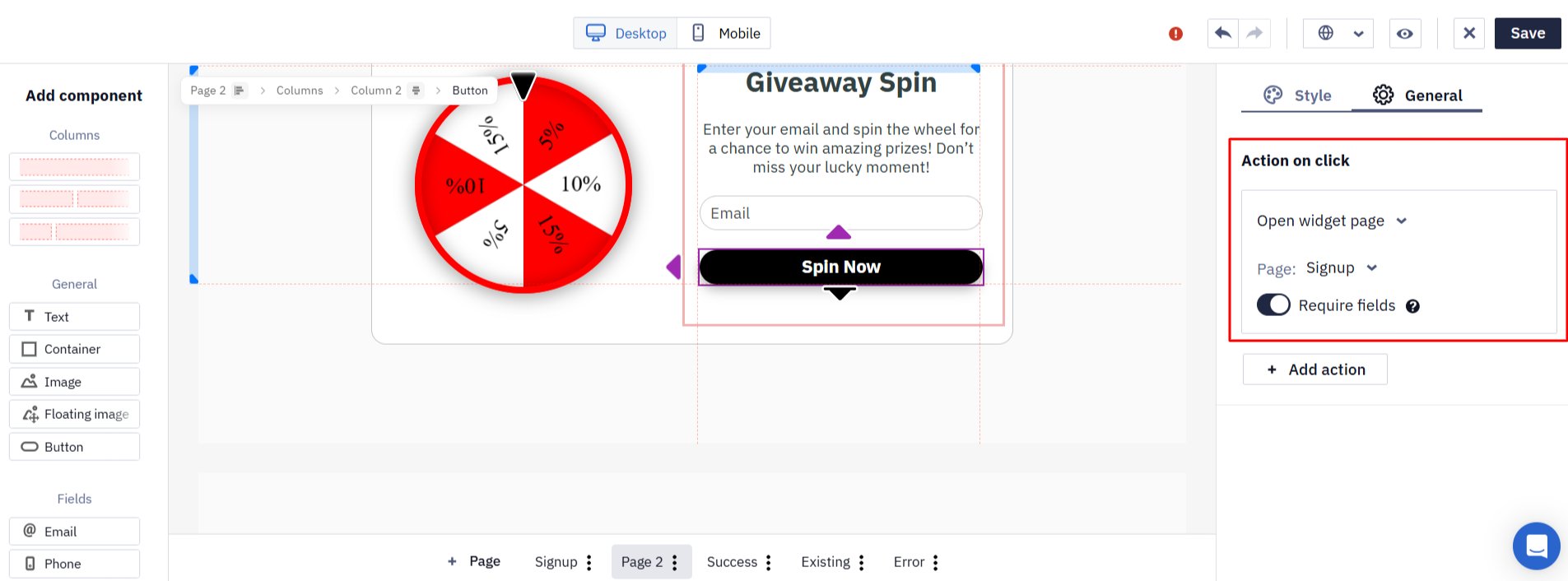
To send the visitor to a particular page, select the Open widget page action and choose the page in the Page field. The Require fields toggle next to it controls whether the form is validated before the transition — leave it on to require the fields to be filled in, or turn it off to let the visitor continue without completing them.
Configuring Clicks as Target Actions
In an Informer, you can enable the Count as a target action option for the Open URL click action. This option determines which clicks are included in the conversion rate calculation:
- if the option is not enabled for any action — all tracked clicks;
- if the option is enabled for at least one action — only clicks associated with those actions.
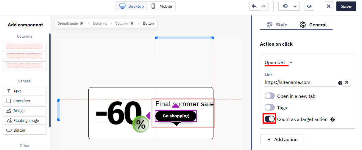
For example, if clicking the Go shopping button is the expected action, enable this option for the button.
For Subscription forms, the system automatically counts form submission as a target action.
You can view the results in the Widget Report.
- Contact field placeholder, validation, and prefill
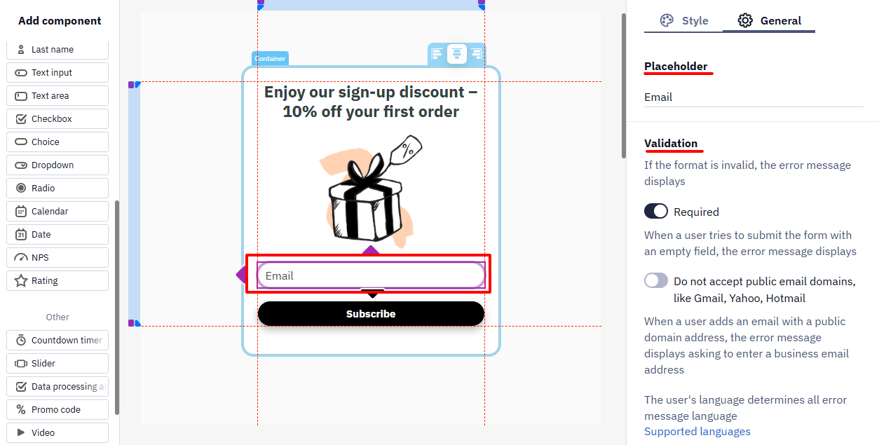
For the Email field, enable the Do not accept public email domains validation option to reject addresses from providers like Gmail, Yahoo, or Hotmail and collect only business email addresses.
Prefilling Form Fields
You can enable prefill for Email, Phone, First Name, Last Name, and text fields. Values can come from:
- Static field — a fixed value from the field settings, the same for every visitor;
- URL query parameter;
- JavaScript variable;
- Local storage;
- Cookie;
- Data layer event.
Select the form field, enable prefill, and configure the selected source. If the system cannot find a value, the field displays its standard placeholder and remains available for manual input.
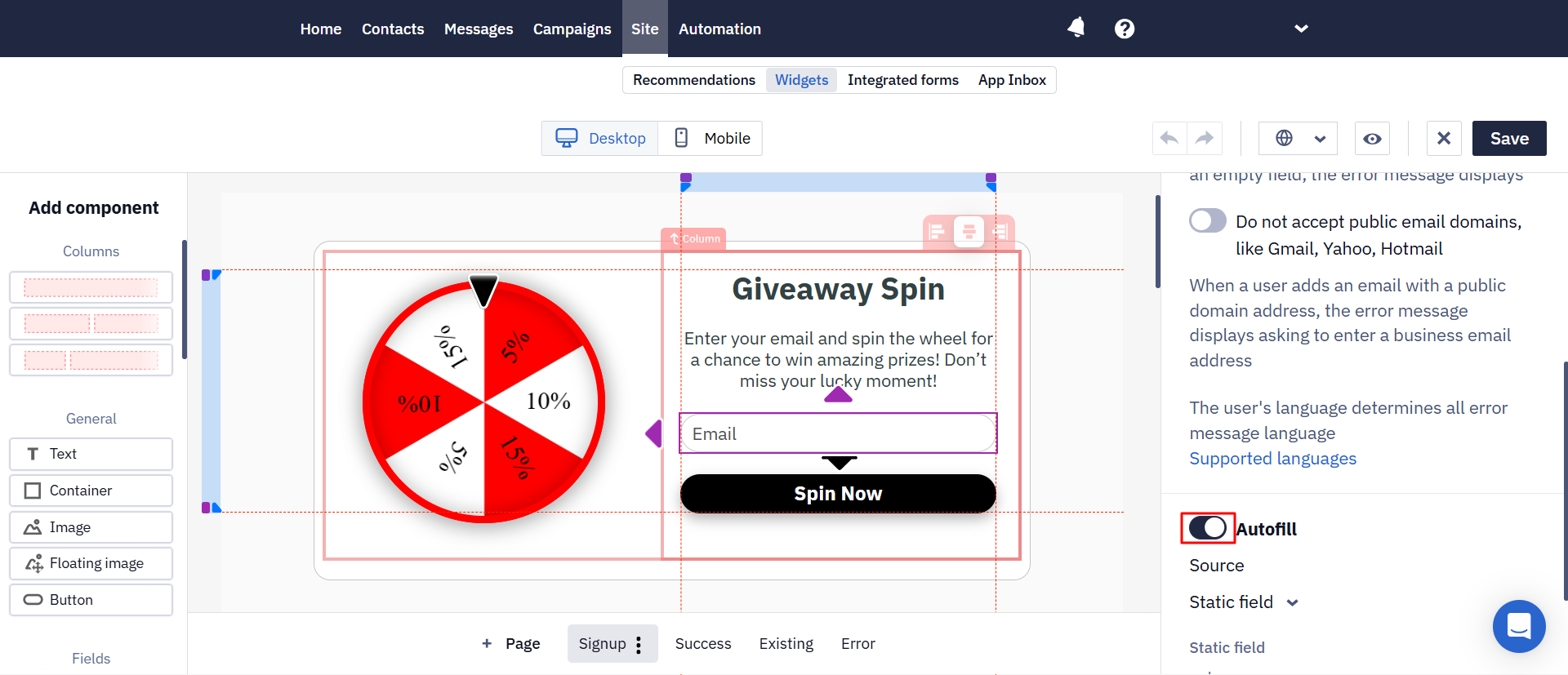
For details about the sources and their settings, see Using Website Data in Widgets.
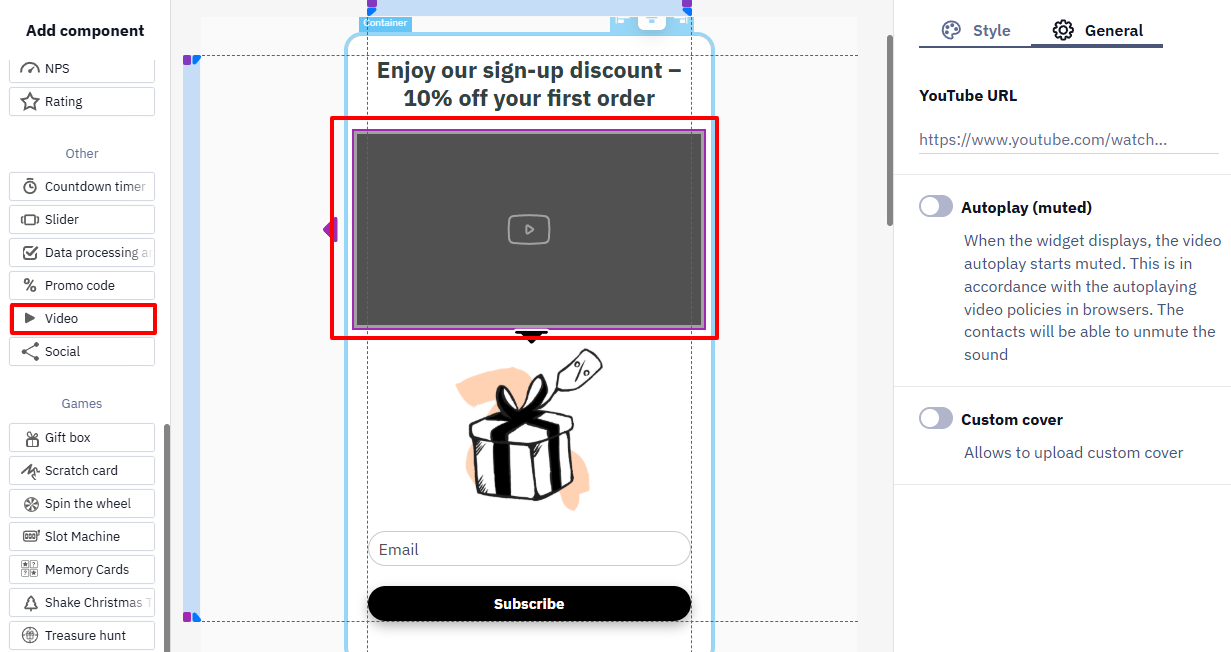
- Video settings
Creating Multi-Step Widgets
A multi-step widget can split a long form across several pages or change the next step based on the user's response. This makes the form easier to complete and supports more complex experiences, including:
- quizzes with different outcomes;
- progressive discounts;
- NPS surveys with follow-up questions;
- forms where the next question, promo code, or CTA depends on the previous response.
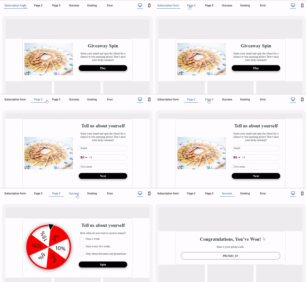
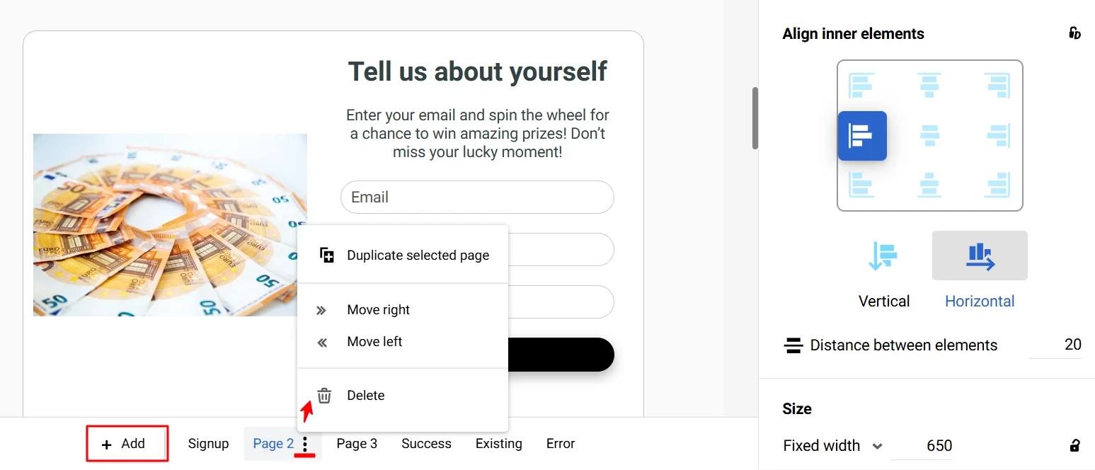
To add a page to the widget, use:
- Add — to create a page based on the current one;
- the three-dot menu on an additional page — to duplicate, move, or delete it.
Configuring Branches
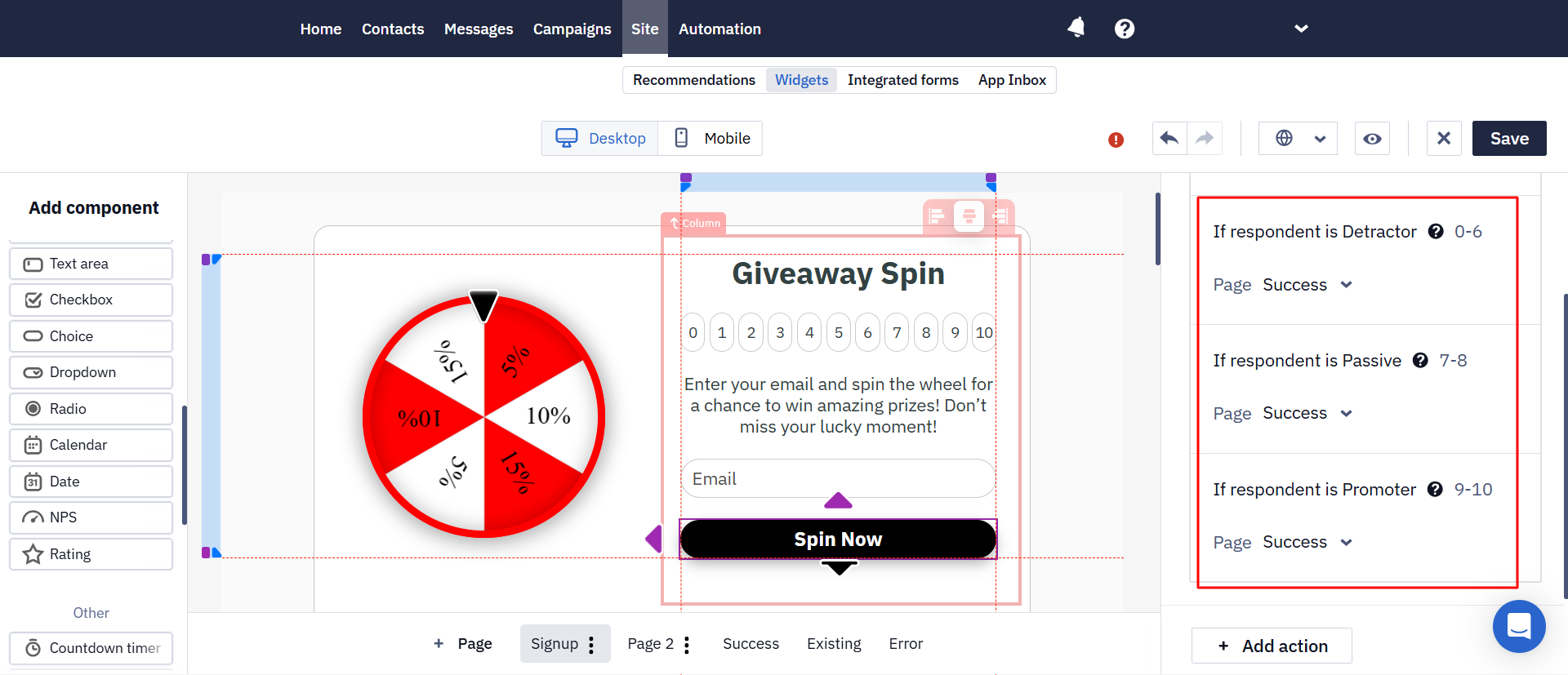
Branches open different widget pages depending on the user's response.
In a game widget, the result page can depend on the reward won — for example, a discount opens a promo code page, while a gift opens a redemption terms page. Select the page in each reward's settings. Only pages placed after the game page are available; the next page in order opens by default. For details, see Reward Result Pages.
- Add all pages that may appear in the flow.
- Select the component whose response determines the next step.
- For each response option, select the page that should open next.
- Configure the content of the final pages.
- Test every branch in preview mode.
For example, in an NPS survey, a score from 0 to 6 can open a page asking why the user gave a low rating, while a score of 9 or 10 can open a request to leave a public review. For details about rating components, see NPS/Rating Widget Components.
- Multi-step forms are available in all widget types except launchers.
- A widget can contain only one game component.
- You can add the Email, Phone, First Name, and Last Name fields on different pages of a widget, but not twice on the same page: the editor won't let you publish such a widget. For example, in an NPS survey promoters, neutral users, and detractors see different pages, and the Email field is needed on each of them.
- Only one value is stored per contact field: if the same field is filled in more than once, the last non-empty value is saved, and an empty field doesn't overwrite a value that is already there.
- Fields on branches the visitor didn't follow don't block submission.
- When you first save a Subscription form or Request form in the Popup or Floating box format, Yespo suggests adding a Teaser if the widget does not have one. You can add it immediately or save the widget without it.
- The last page of a multi-step widget is the system Success page: in a widget that asks for an email, then a phone number, and then offers links, those offers go on the Success page.
- The maximum number of pages is 20.
- Partial data collection for abandoned forms is not available yet — it is pending backend work. Because of this, "the user filled in at least one field" can't currently be treated as a reliable indicator of a submission.
Widget Placement
- The age gate takes the size of the screen and completely overlaps the pages of the site until the user confirms their age, so this widget has no placement settings.
- The positioning of a launcher is configured in the appearance editing window.
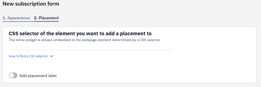
- To specify a positioning of a subscription form or informer, enter the CSS selector of the element you want to add a placement to. This tab appears after you have customized the widget's appearance and clicked the Save button.
- Select where to add the widget relative to the found element:
- Before the element
- After the element
- Inside the element, last
- Inside the element, first
- Replace element
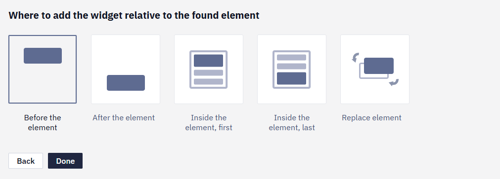
You can insert up to ten embedded forms on one page, which is especially useful for long articles or landing pages.
If you are not ready to specify the widget placement, activate the Add placement later switch.
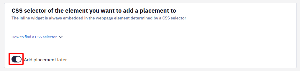
- Click Done. Initially, the form will be visible only to you; on the Parameters tab, you can make it public.
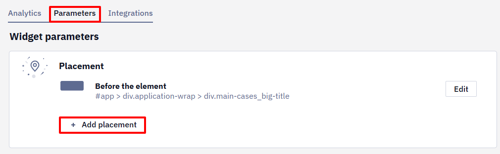
- Create additional placements as needed.
Widget Parameters
In the Parameters tab, you can:
- Edit the widget's appearance.
- Edit the placement of the form or informer.
- Configure widget calling conditions.
- Configure the actions after the user has subscribed or clicked on the launcher.
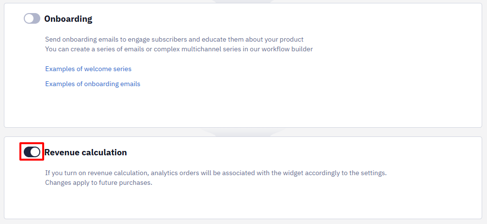
- Activate or deactivate the calculation of the revenue from the widget (the settings are described in the instructions).
Publishing a Widget
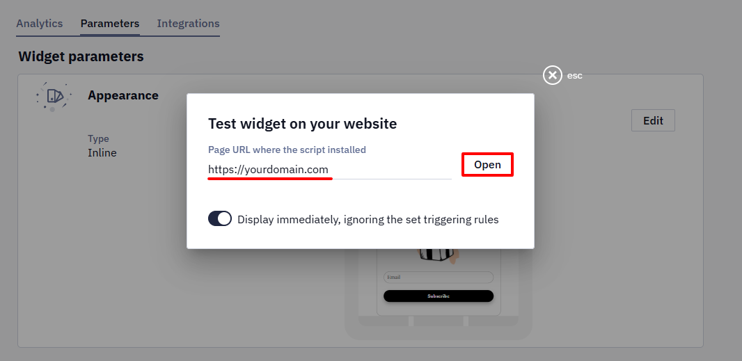
- Having saved all the settings, check how visitors will see the widget on the site — click on the Test widget button.

- Enter the link to your website and click Open.
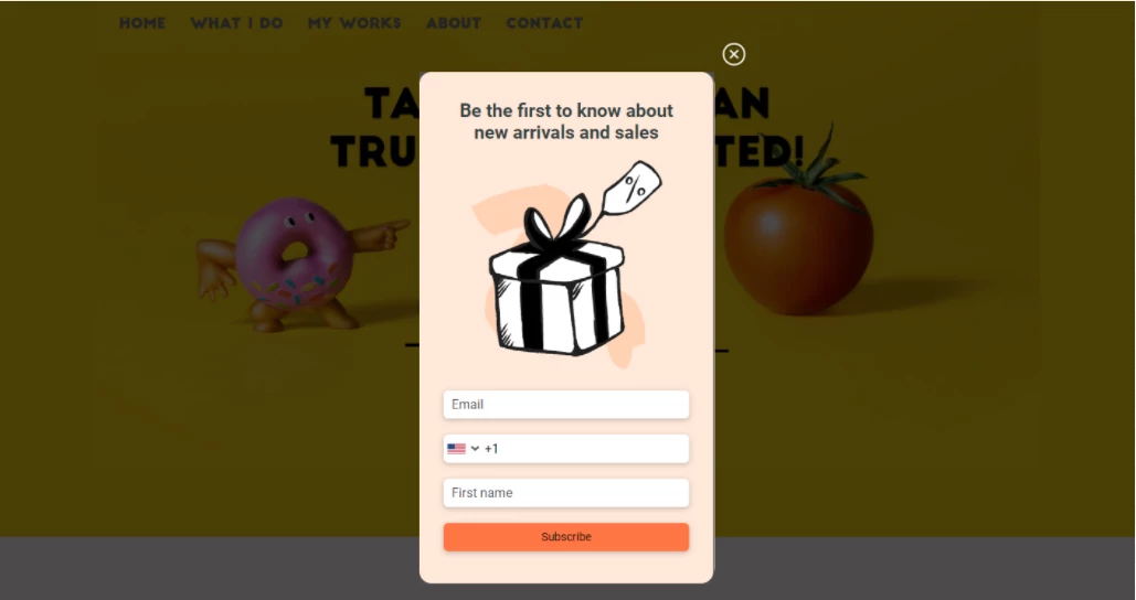
- If all steps are successful, the widget will be displayed on your website according to the specified conditions.
- After testing the form, publish it by clicking on the Published button, then click Save.
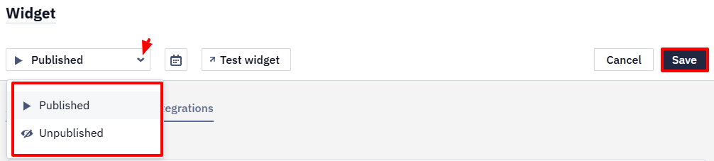
Click the Unpublished button to stop displaying the form, then save the changes.
Also, you can specify the widget’s schedule by clicking on the calendar icon.

The schedule includes the following settings:
- Start and end dates
- Custom days and time
- User timezone
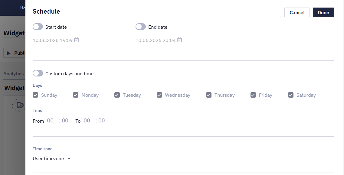
Widget statuses are displayed in the general list and in widget details:
- Published — for published widgets with a current or no scheduled period
- Unpublished
- Scheduled — the publication period is planned for the future
- Expired — the publication period has expired
Widget Integrations
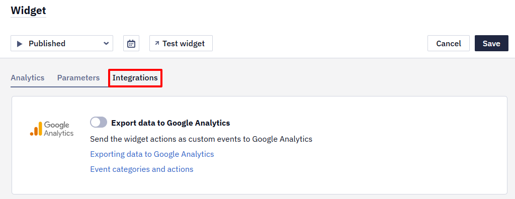
On the Integrations tab, you can configure sending widget actions and custom events to Google Analytics. Note that integration is only compatible with Universal analytics script, set directly on the website.
Learn more about exporting data to Google Analytics >
NoteWidgets don't include built-in CAPTCHA or other anti-bot protection. If bots submit a subscription form, use double opt-in on the platform side and bot protection on the website side — a WAF or the bot-management mode of your CDN, and rate limiting for repeated submissions.
Further settings include:
An embedded widget takes the alignment of the element it is placed after, so a widget that looks off-centre is usually inheriting that from the site. The editor controls the widget's own styles only. To centre it, give the widget the full width of the parent container and centre the content inside the widget.
Updated 7 days ago