
Designing Your Email
Email design defines fonts, colors, backgrounds, paddings, as well as the appearance of buttons and headings. These settings apply to the entire message, allowing you to quickly create a consistent design without editing individual elements.
General Styles
The General Styles panel contains all email design settings. The panel includes the following tabs:
- Global Styles & Layout
- Stripe Styles
- Heading Styles
- Button Styles
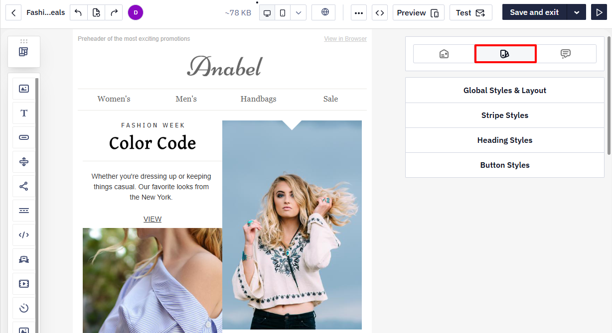
When creating a message, you can edit any element individually — a stripe, structure, container, or block. If an element has its own custom settings, they take priority over the global ones and will be applied instead.
Global Styles and Layout
In this tab, you define the basic settings that apply to the entire email:
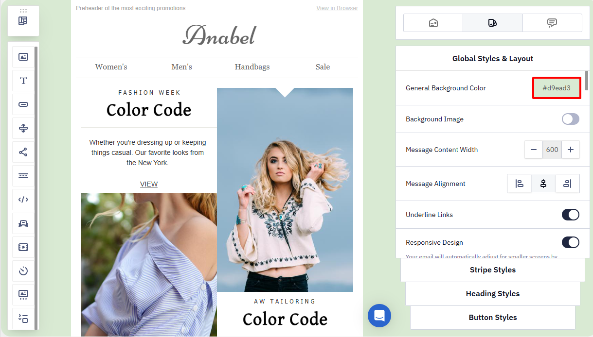
- Background color — choose a solid background for the whole email. You can select a color from the palette or enter a color code manually. By default, the background is transparent.
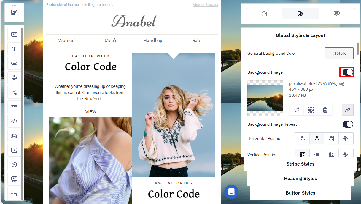
- Background image — enable the toggle to set a background image. You can upload your own image, choose one from the gallery, or paste a link to an external resource.
Background image settings:
- Repeat — determines whether the image is tiled across the background.
- Horizontal and vertical position — sets the image position relative to the container (for example, center, left, right, top, or bottom).
- Background width and height — allow you to resize the image to better fit the email.
Supported formats: PNG, JPG, GIF; up to 3 MB in size; up to 4000 px wide.
OutlookSome email clients do not support background images (for example, Windows 10 Mail, older Android Mail apps, mobile Gmail, and others). In such cases, we recommend setting a similar background color as a fallback. This ensures readability if the image is not displayed.
Desktop Outlook does not render
background-imageset at the stripe, structure, or container level (the Styles tab of an individual element) — only the email-wide background image configured in Global Styles displays correctly in Outlook. If you need a background image behind a specific section rather than the whole email, add a matching background color as a fallback for that element so Outlook shows a solid color instead of a blank area.
- Content width — the optimal email width for correct display on different devices. The default value is 600 px.
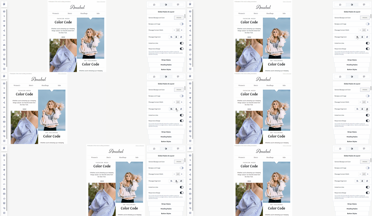
- Alignment — the position of the email on the recipient’s screen. You can align the email content to the left, center, or right.
- Underline links — controls the styling of hyperlinks in the message. By default, all links are underlined. If underlining is not required, disable the toggle.
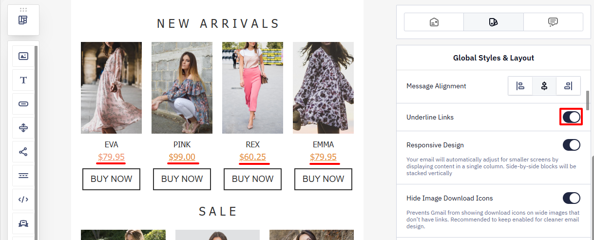
This setting only controls how links are styled. To turn specific text into a hyperlink, highlight it inside a Text block and click the chain-link icon in the Settings panel, then choose the link type (URL, email, phone number, etc.) and enter the destination. To remove a link, highlight the linked text and click the unchain icon in the same panel.
- Responsive design — automatically adapts the email layout for mobile devices. If needed, you can further adjust how individual elements appear in the mobile version. More about setting up responsive design >
- Right-to-left text direction — a display mode for languages written from right to left. If you are creating an email in Arabic, Farsi (Persian), Hebrew, or another RTL language, enable this option so the text and layout are aligned to the right and displayed correctly.
Right-to-left direction doesn't have to apply to the whole email — you can also enable it for a single text block from that block's own Settings panel, which is useful when only part of your content (for example, an Arabic or Hebrew quote) needs RTL formatting while the rest of the email stays left-to-right.
- Custom list styles — allows you to customize the appearance of bulleted and numbered lists in the email. You can choose the color of bullets or numbers and set spacing before the list (to control the distance between preceding text and the list). This is useful when the default list styling does not fit your email design.
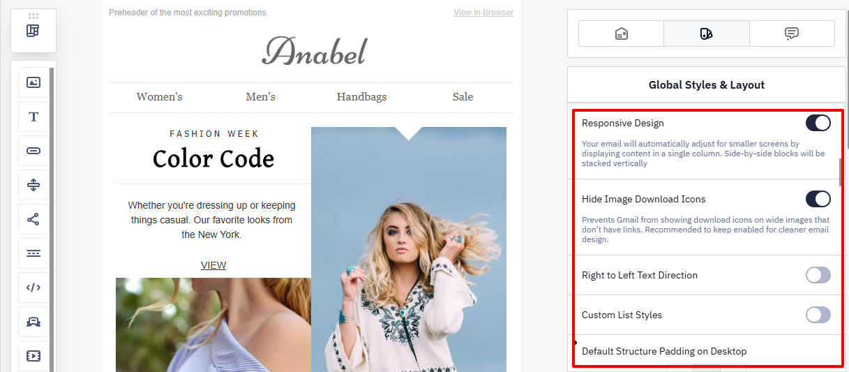
Custom List Styles also let you fine-tune left indentation and the spacing between individual list items, in addition to bullet/number color and spacing before the list. If an ordered list is split across two separate text blocks and you need numbering to continue instead of restarting, open the second block's code editor and add a start attribute to the list tag — for example, <ol start="4"> continues the count from item 4.
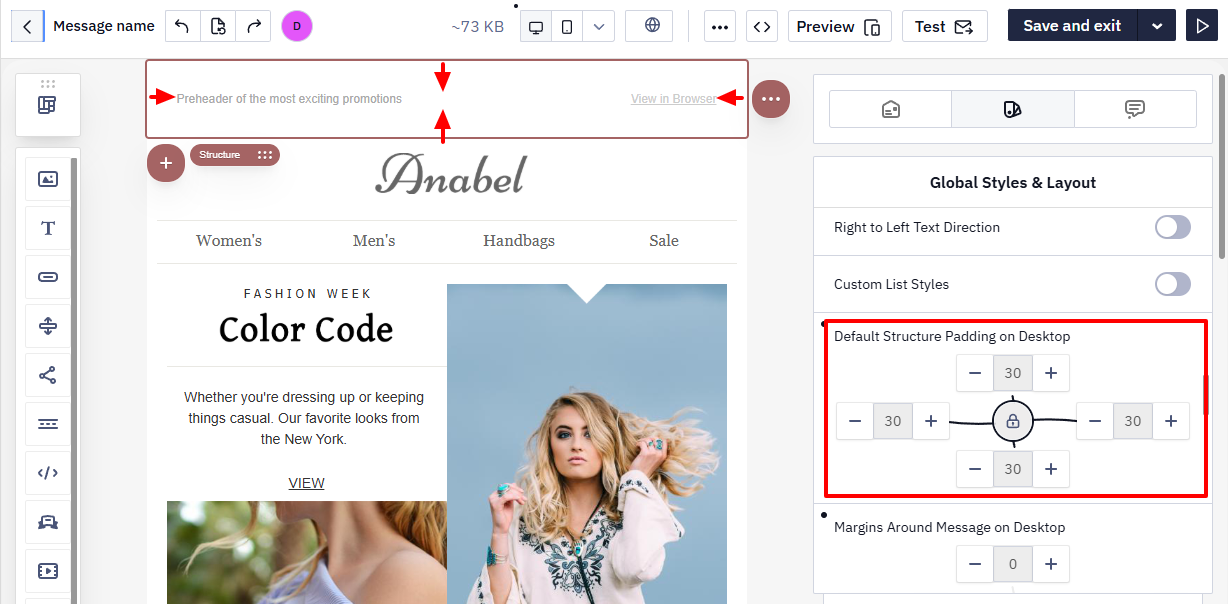
- Spacing — lets you define the space between the email content and its edges, as well as inner spacing for structures.
- Default structure padding on desktop;
Custom spacing set for a specific structure or saved in modules is not affected by these settings.
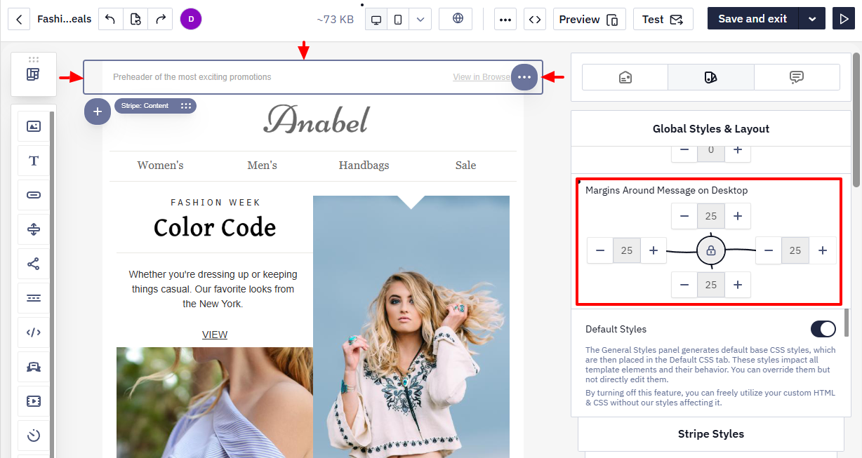
- Margins around message on desktop
Stripe Styles
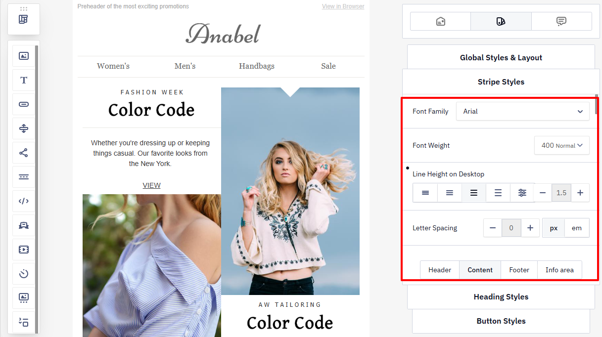
Use this tab to define the design for all parts of the email: header, content, footer, and info area.
General settings (applied to all sections)
- Font family
- Line height
- Letter spacing
Individual settings (configured separately for each section)
- Content background color (header, content, footer)
- Background image (header, footer)
- Font size
- Font color
- Link color
- Hover link color
- Paragraph bottom space
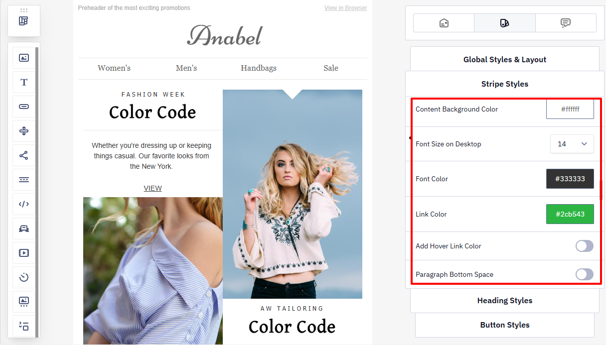
If the Paragraph bottom space option is enabled, the system automatically applies optimal spacing between paragraphs for comfortable reading, regardless of font size or line-height settings.
Heading Styles
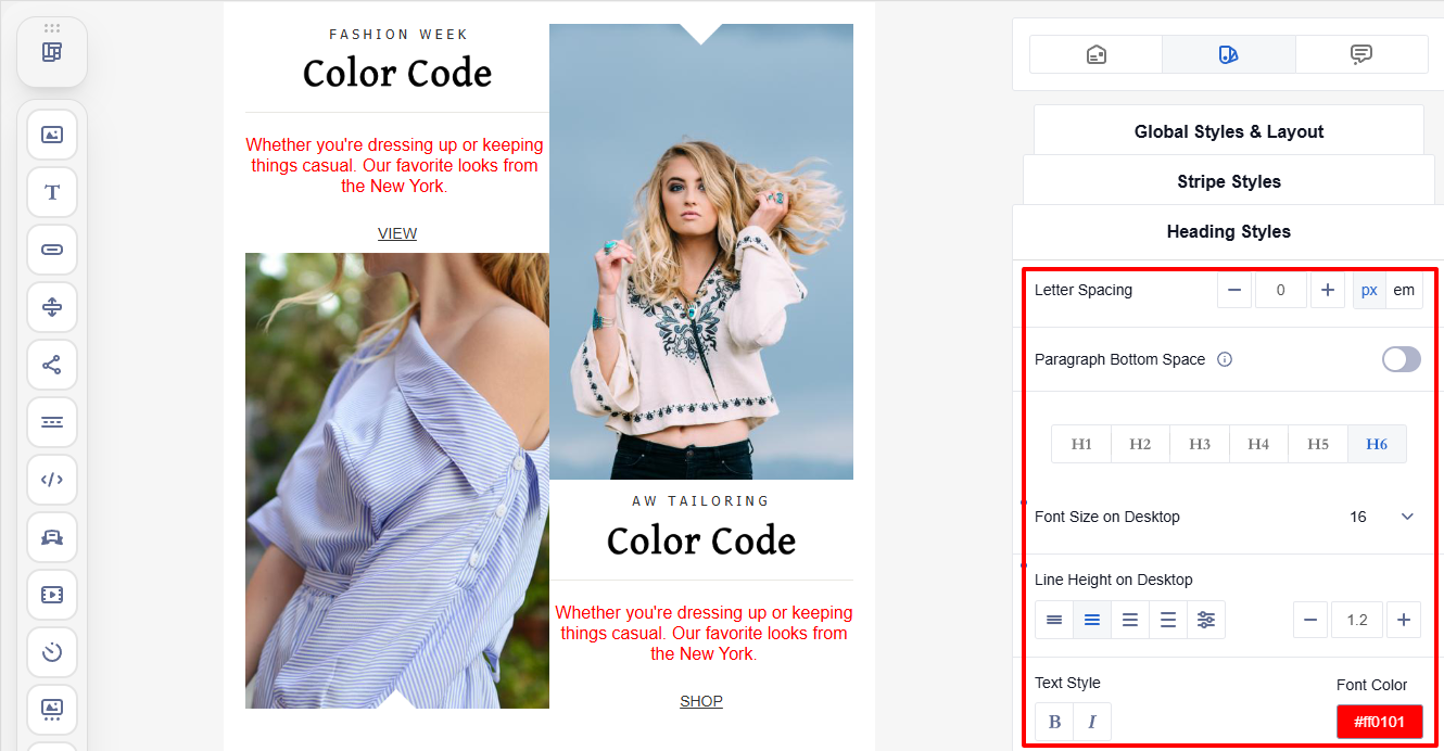
Customize the appearance of all headings in the email (H1–H6): font family, letter spacing, paragraph bottom space, font size, and line height spacing, as well as text style and font color.
You can adjust the appearance of each heading level individually.
Buttons Styles
Set a consistent appearance for all buttons in the email, regardless of their placement.
Button settings:
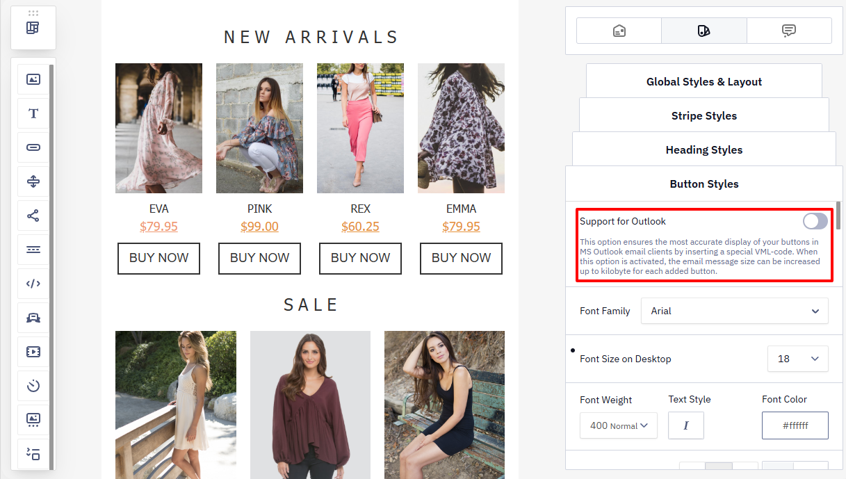
- Outlook support — a special option for Microsoft Outlook email clients.
- When enabled, VML code is added to buttons to ensure correct rendering.
- The email size increases by approximately 1 KB per button.
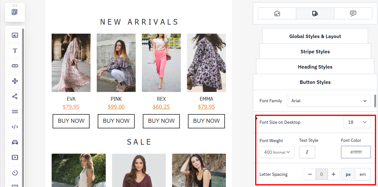
- Font family
- Font size
- Text style and font color
- Letter spacing
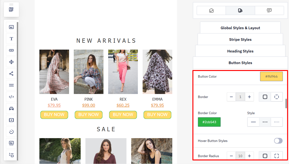
- Button color
- Border (color and style)
- Border radius
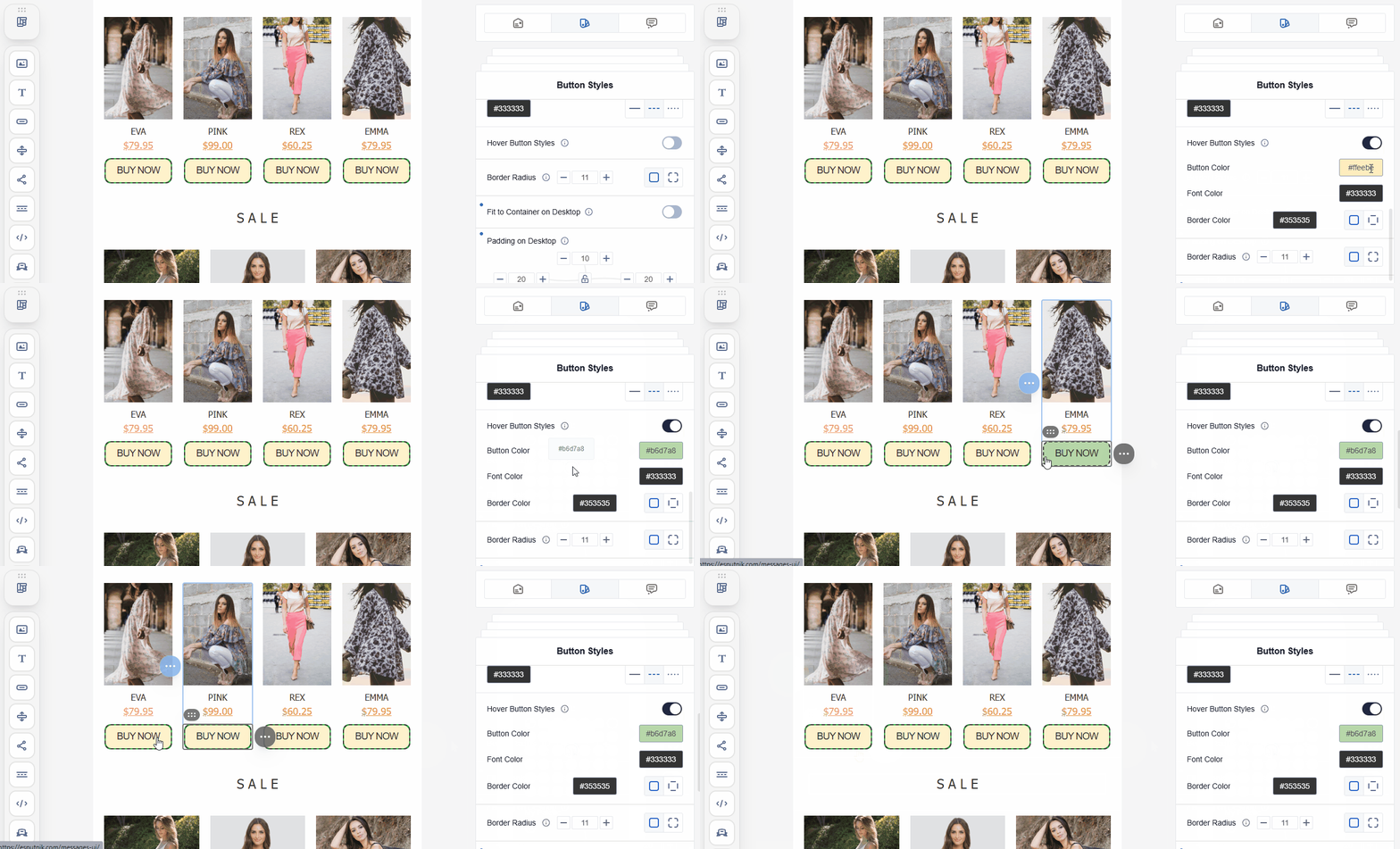
- Hover button styles — allow you to define a different background, text color, or border that appears on hover. This makes buttons more interactive and highlights their clickability.
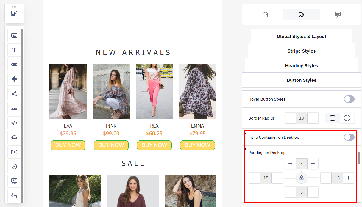
- Fit to container
- Padding
The text and link of each button can be changed only in the Settings tab when editing a Button block. The Global styles and layout tab controls only the appearance of buttons, not their content or destination URL.
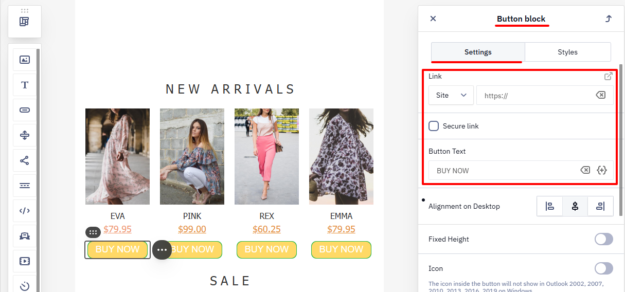
Learn more about creating a CTA button >
Saving Changes
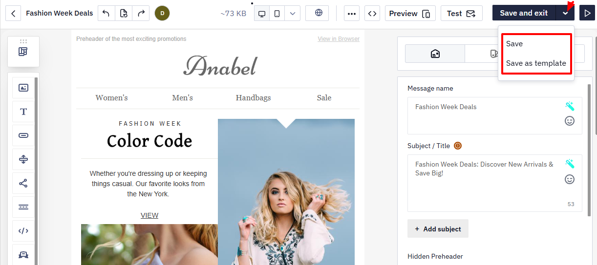
When all changes are complete, click Save or Save and exit.
To save the email as a template, select Save → Save as template from the menu.
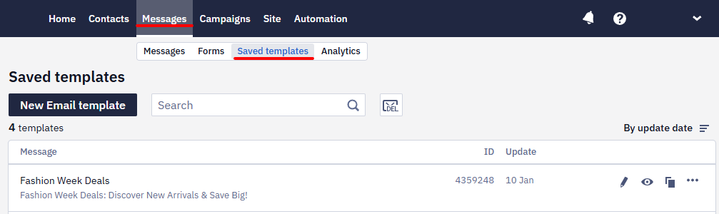
All saved templates are available in Messages → Saved templates.
Updated 2 months ago