
Email Structure
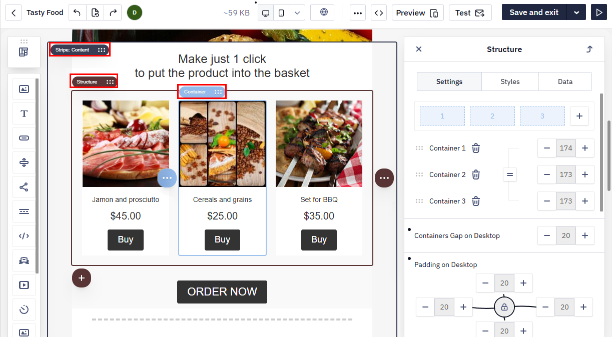
To flexibly create emails that display correctly in all email clients (Gmail, Outlook, Apple Mail) and on different devices, the editor uses a four-level hierarchy: Stripe → Structure → Container → Block.
Uploading your own HTMLThe editor opens an HTML template even when it doesn't follow the structure described below. Adapt the template to the Yespo structure before you send, and check the result in the editor. When you save the template in the editor, the editor adds its own service attributes and styles to the code; the email content stays the same.
Add the editor classes, such as
esd-block-textandesd-block-image, only to blocks that follow this structure. If such a class is left in arbitrary markup, the email may not open in the editor — remove the class from that element.
Stripes
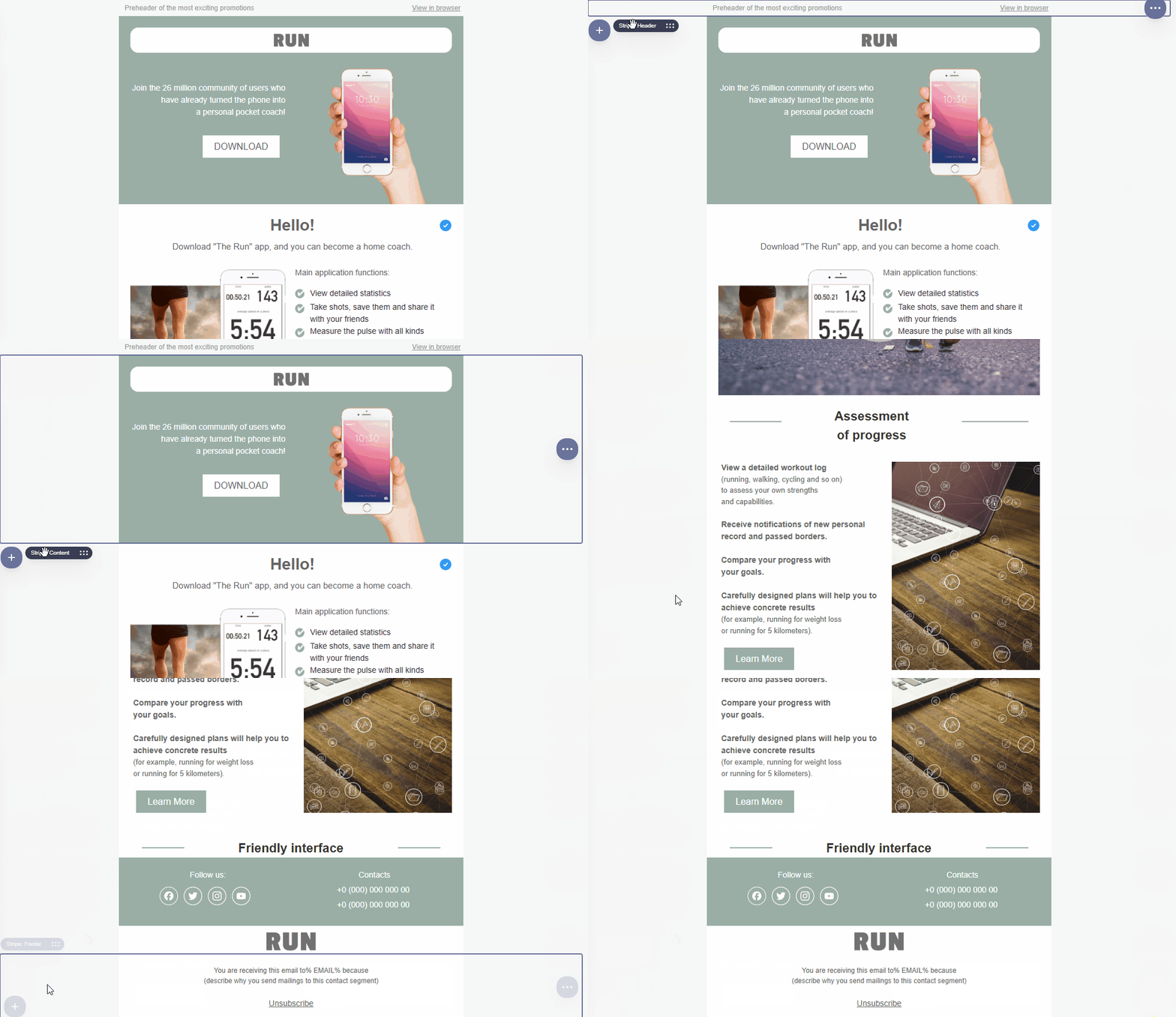
Stripe is a top-level element that divides an email into horizontal sections and helps organize the main areas of the message:
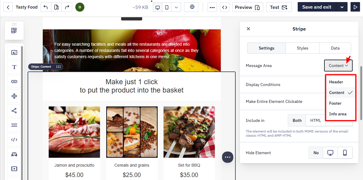
- Header — the top part of the email with a logo or navigation;
- Content — the main area containing text, images, buttons, and other blocks;
- Footer — the bottom section with contact information, social media links, and legal details;
- Info area — placed above the header or below the footer and contains service links (for example, view in browser or unsubscribe links).
When a contact opens the view-in-browser link, the web version shows a service panel above the email. Its language follows the reader's browser language when a translation for that language exists, and English otherwise.
Add the view-in-browser link in the settings of a text or a button: in the list of link types, open the tab with the Special links group and choose View in browser. If you paste a copied address of the web version as a regular Site link instead, the contact opens a version where the dynamic content, product blocks among them, is not substituted.
Structures
Structure is an element inside a Stripe that defines the number of containers in a horizontal row.
To add another structure, click the + icon and select the required configuration.
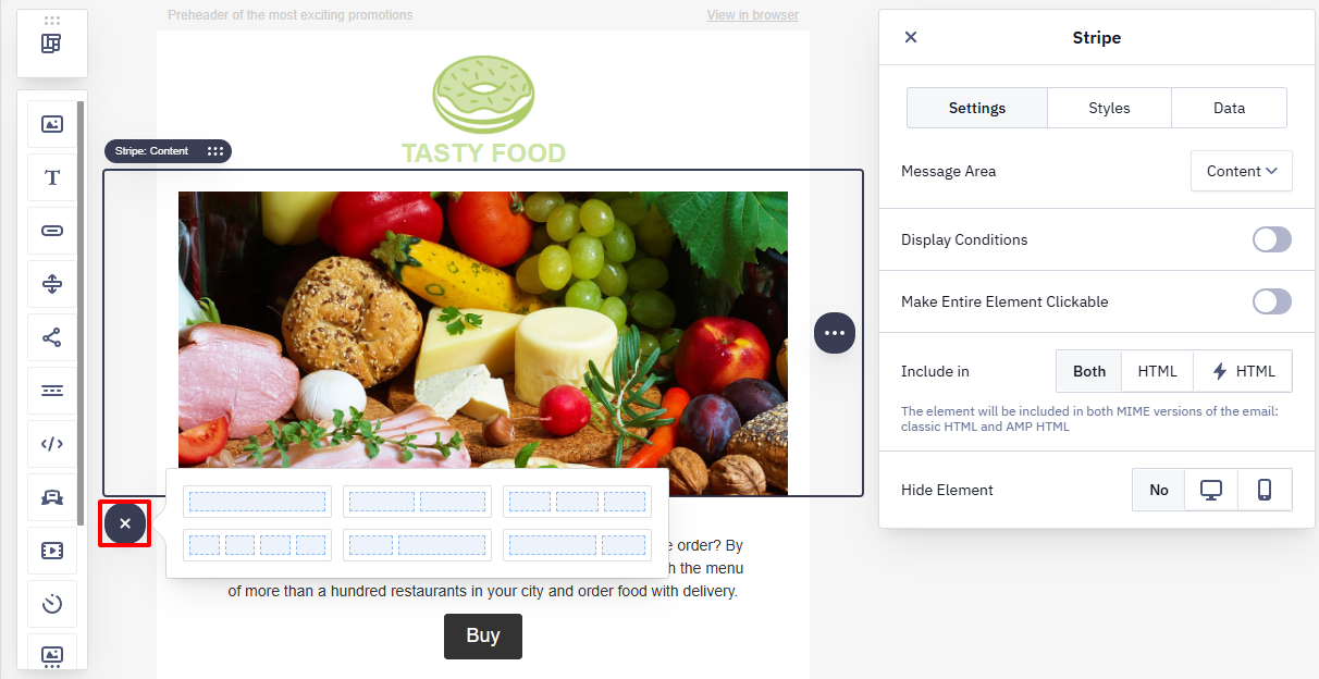
A structure can contain up to 11 containers in a row.
NoteIt is not recommended to use separate Stripes for each Structure unless necessary, as the number of stripes affects the size of the HTML email and may lead to partial email display in Gmail.
Containers
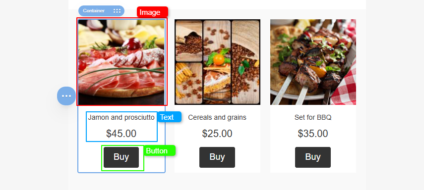
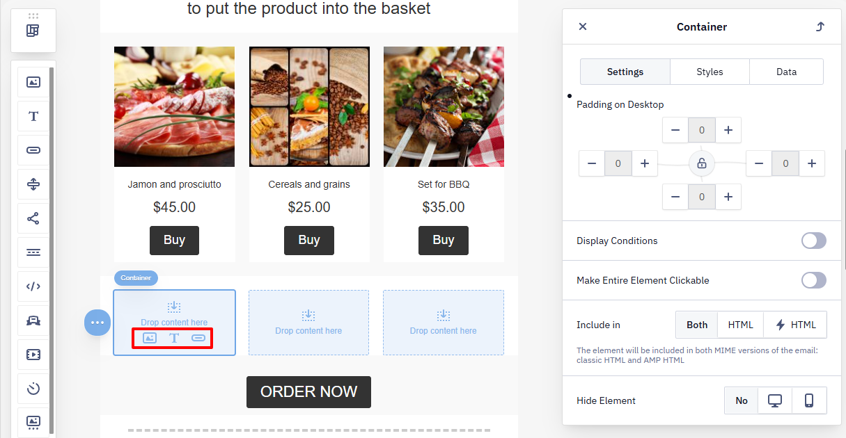
A Container groups content inside a Structure. You place blocks inside containers — for example, to create a product card.
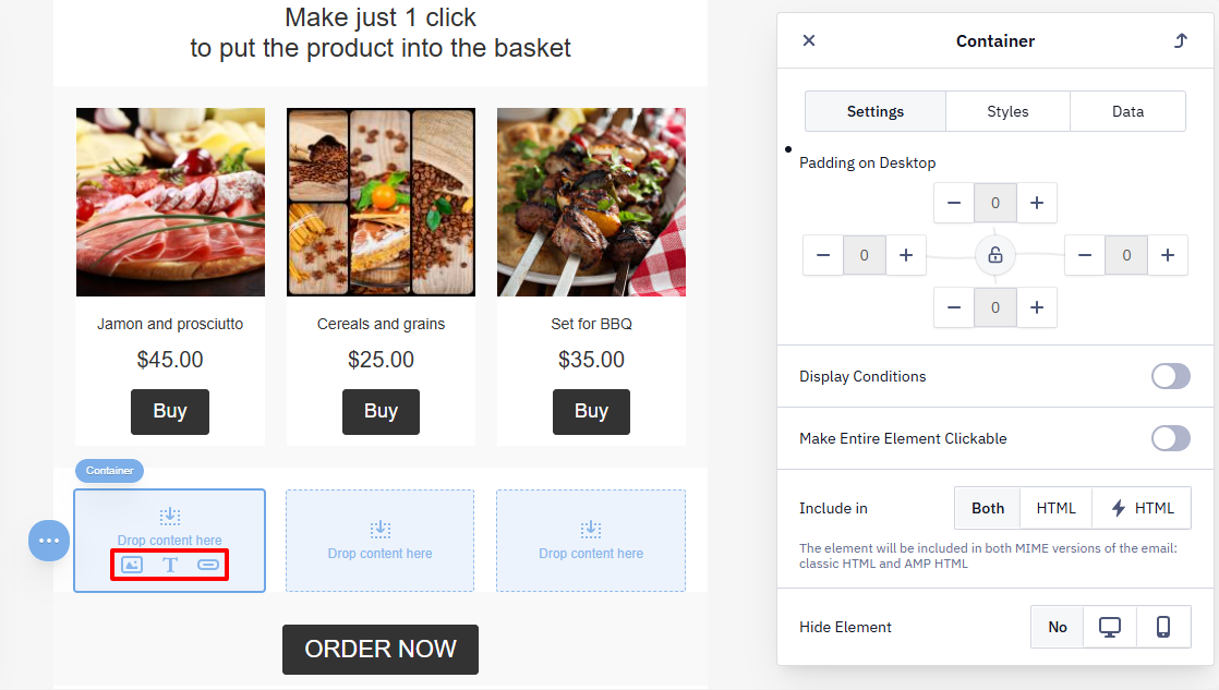
In an empty container, you will see icons for adding basic blocks:
- image;
- text;
- button.
Element Settings
Stripes, Structures, and Containers share a unified set of tabs.
Settings Tab
This tab contains parameters that define the element’s behavior and the conditions for its display in the email. The available options may include both common settings (available for all elements) and element-specific ones, depending on the element type (Stripe, Structure, or Container).
Common settings:
- Padding (except for Stripe) — outer and inner spacing between structures and containers with blocks;
- Display Conditions — rules for showing or hiding the element after the email is sent;
- Include in — select the email version where the element appears (HTML, AMP HTML, or both);
- Hide element — hide the element in the desktop or mobile version of the email.
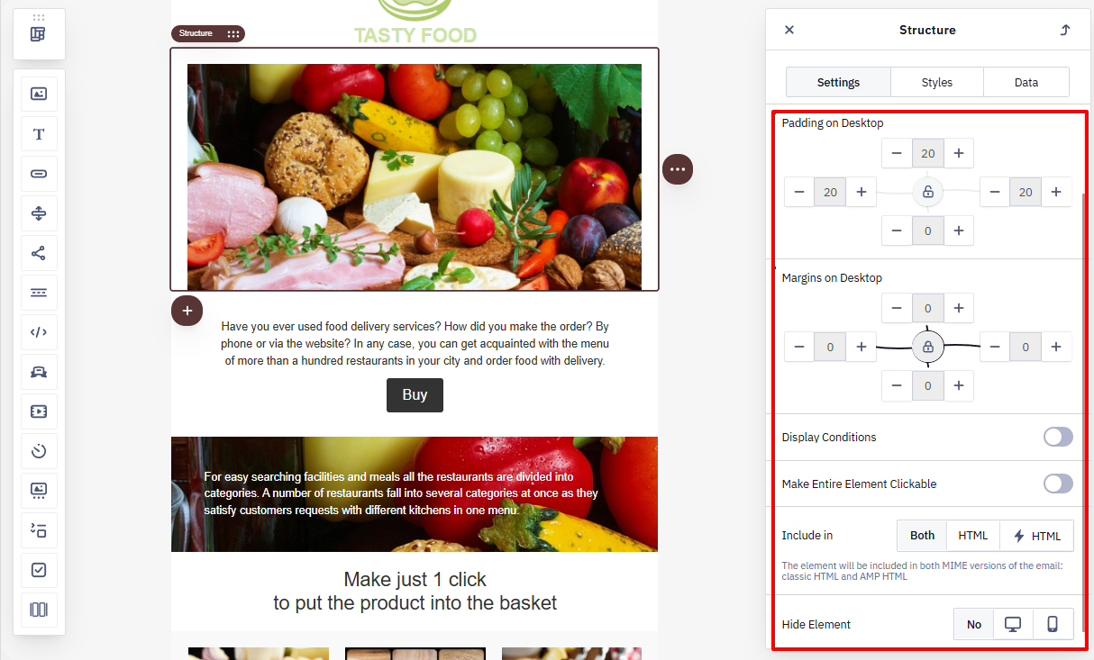
NoteSwitch the preview to Mobile (the device icon in the toolbar) before opening a structure or container's Settings tab to see mobile-specific controls — Containers Inversion, Padding on Mobile, and Margins on Mobile. These apply only to the mobile view and are separate from the default padding/margin settings shown in desktop preview.
Specific settings:
- Stripe — configure the email area (Header, Content, Footer, or Info area);
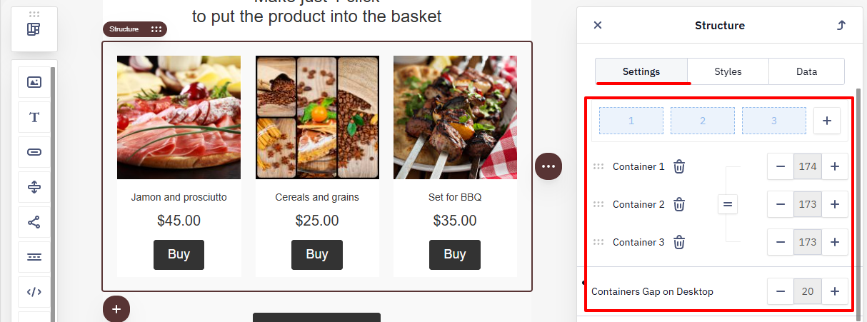
- Structure — set the number of containers, their width, and the spacing between them.
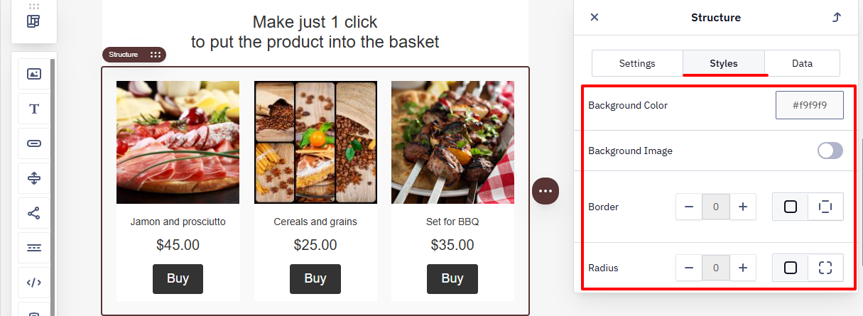
Styles Tab
Data Tab
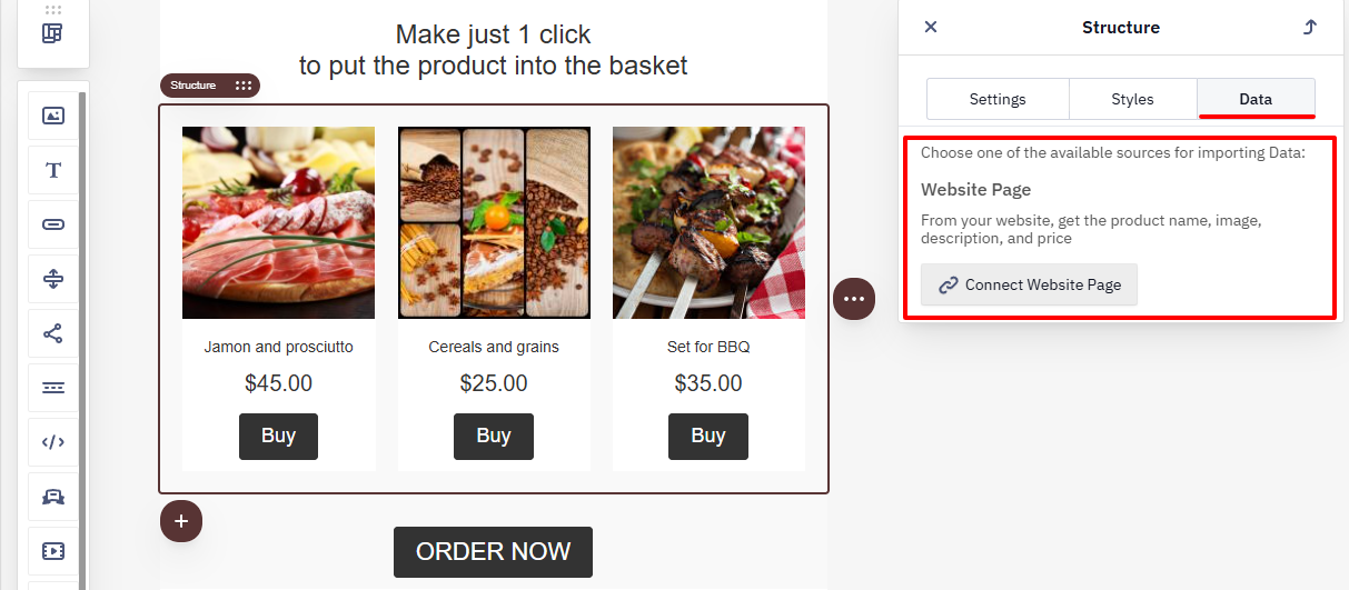
Use this tab to connect data sources and work with dynamic content (for example, data from a website).
Learn more about configuring smart containers >
Blocks
A Block is the smallest structural element of an email template. You place it inside a container, where it holds the content. Use a block to add text, images, buttons, videos, and other message elements.
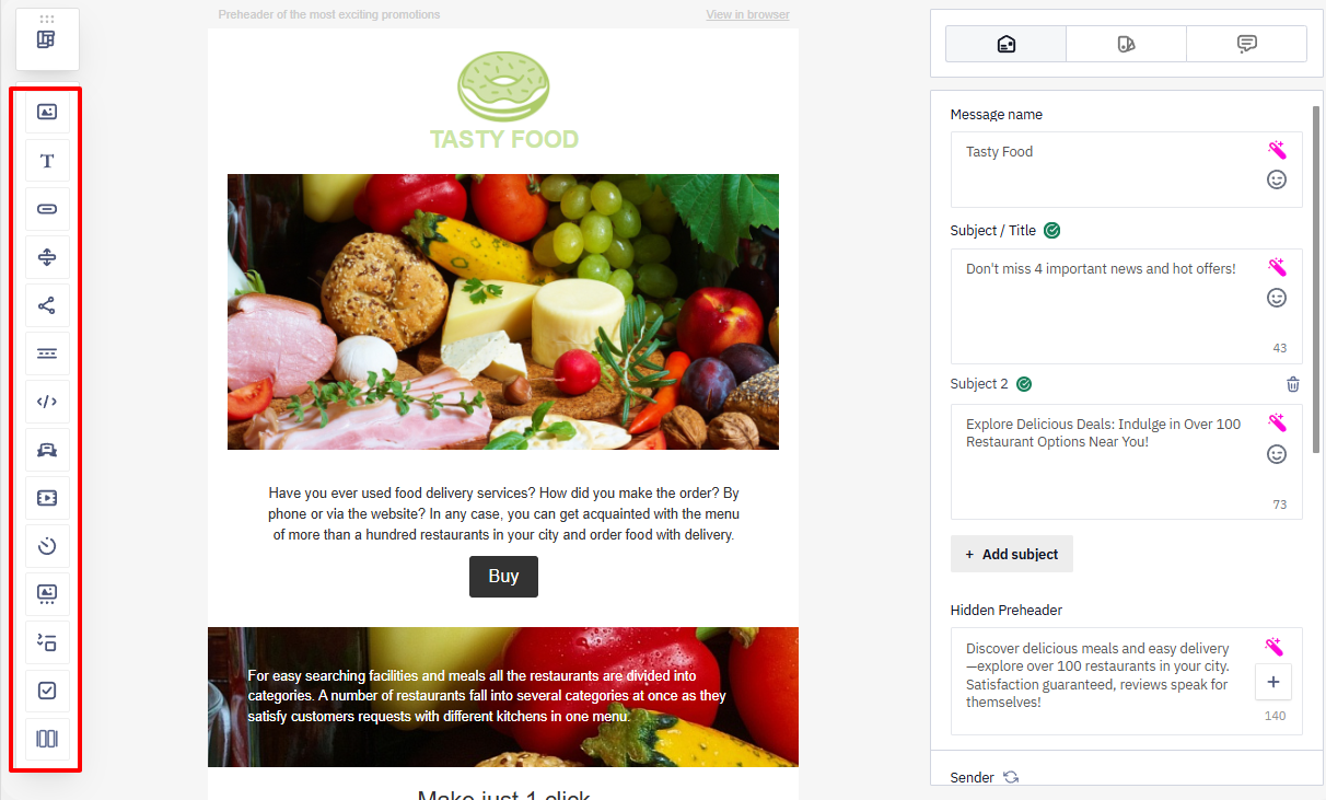
The editor’s side panel contains all available blocks.
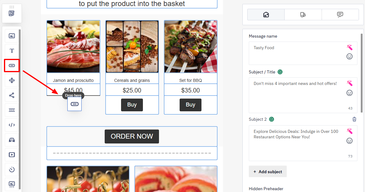
To add a block, drag it into a container.
NoteIf the container is empty, quick-add icons for basic blocks (image, text, button) appear inside it. Click the required icon to add a block without dragging it from the panel.
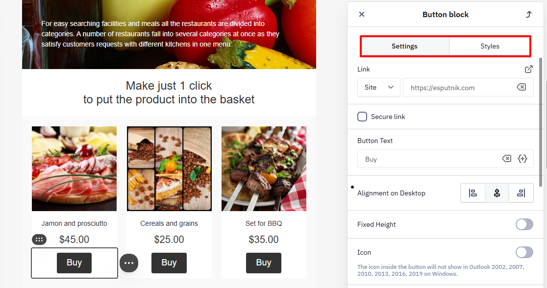
Click the block to open its settings, grouped into the following tabs:
- Settings — define the block’s behavior and display conditions in the email: links, spacing, alignment, display conditions, and more.
- Styles — control the appearance: colors, background, borders, and other visual properties.
Let's look at the elements of the Blocks tab.
Image
Check out the possibilities of working with images in a separate article.
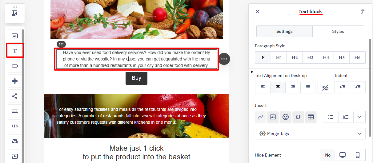
Text
The text block has a built-in editor that allows you to change the font, background color, indents, etc. In addition, the text generator using artificial intelligence is at your service.
Button
Check out the possibilities of working with buttons in a separate article.
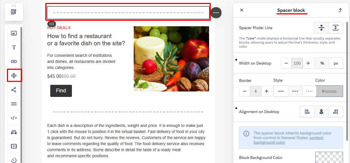
Spacer
The spacer helps visually separate different content blocks. In the block settings, you can select the line type, color, adaptivity, etc.
Social Networks
Adds links to the brand’s social media pages — Facebook, Instagram, and others.
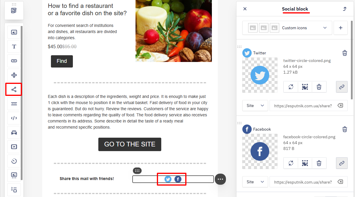
Block settings:
- Icon type – choose the display style of social media logos: colored or monochrome.
- Social networks list – add, disable, reorder, and enter links for Facebook, X, Instagram, YouTube, and others.
- Icon size – set the height and width of the icons in pixels.
- Space between icons – adjust the horizontal spacing between icons on large screens.
- Title and alt text – additional labels for accessibility and hover tooltips (can be enabled or disabled if needed).
Menu
The Menu block is placed in almost all emails. You can add it both in the header and in the footer. The menu is an easy way to add small CTAs if, for example, the user is not interested in the campaign offer but knows what they want to see on the site. Usually, the block from campaign to campaign stays the same.
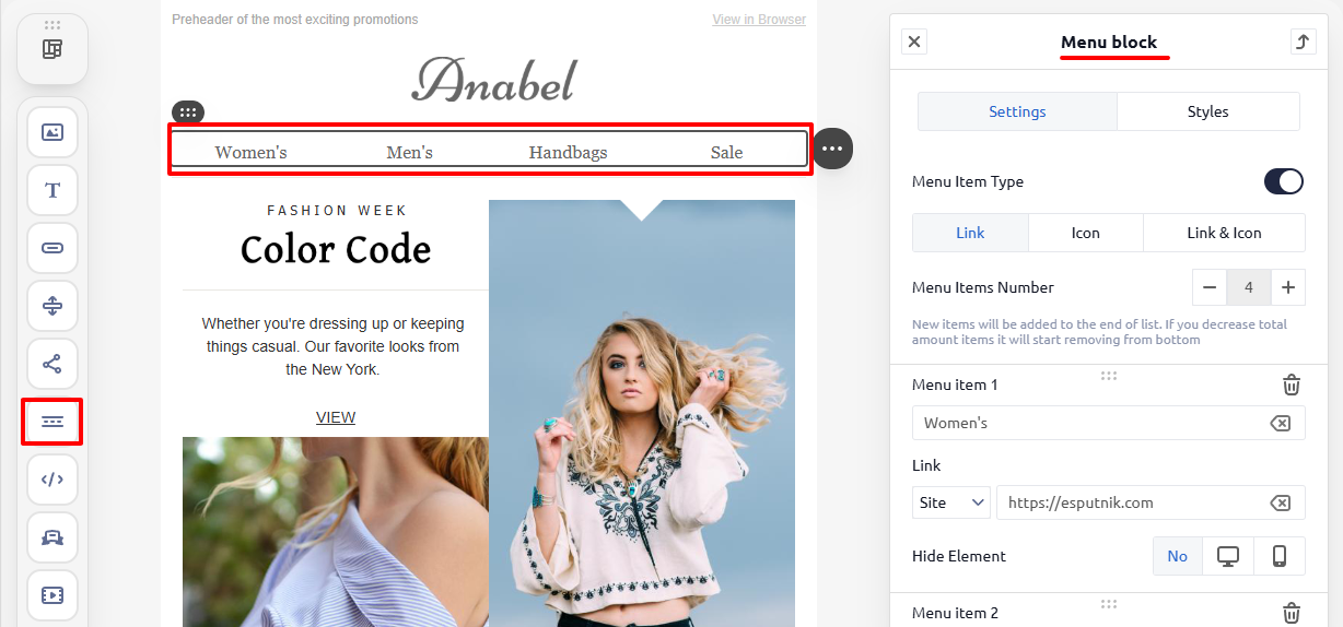
There are 3 types of menus:
- links
- icons
- icons and links
HTML
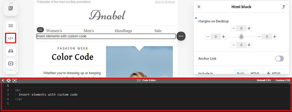
The HTML block is intended for adding your own HTML and CSS code. Note that only the functions of editing pictures and links will be available from the entire adaptive editor. The user configures the adaptability independently.
Banner
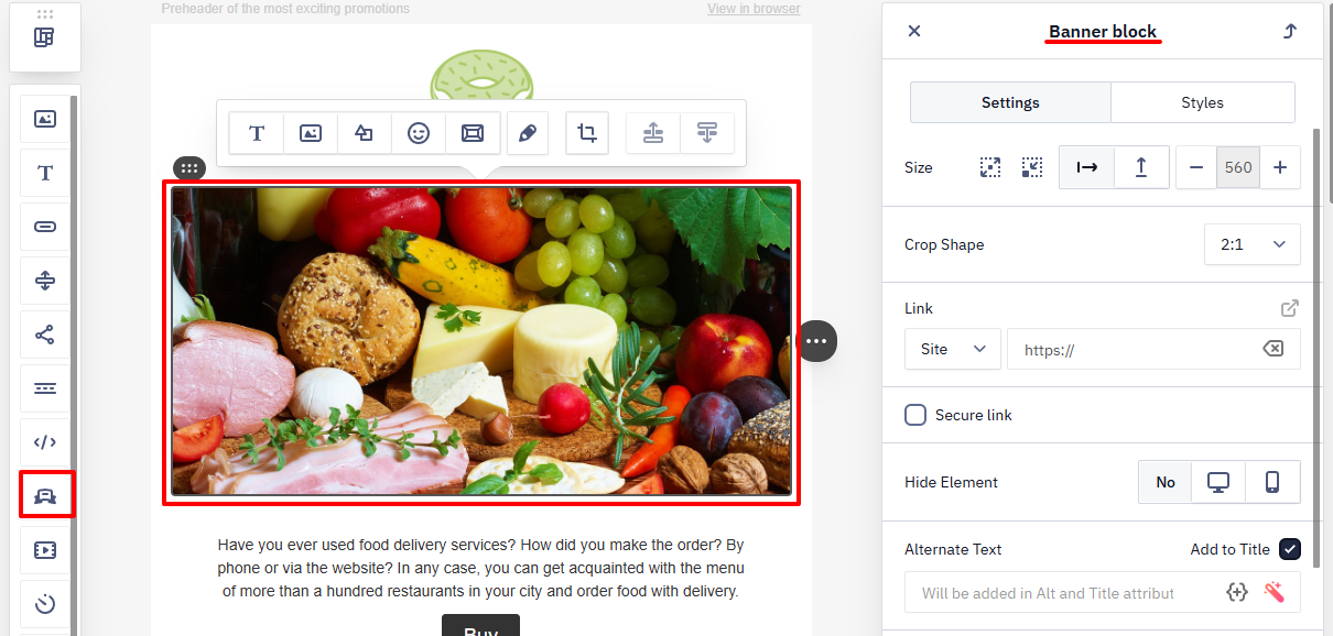
Displays a large visual element for the main message of the email. Image editing tools are available, similar to those in the Image block.
Video
The block displays videos from external platforms such as YouTube, Vimeo, or Instagram. The email shows a preview image with a Play button that opens the video page. This helps attract attention and increase engagement, for example, for product reviews, promo videos, or branded content.
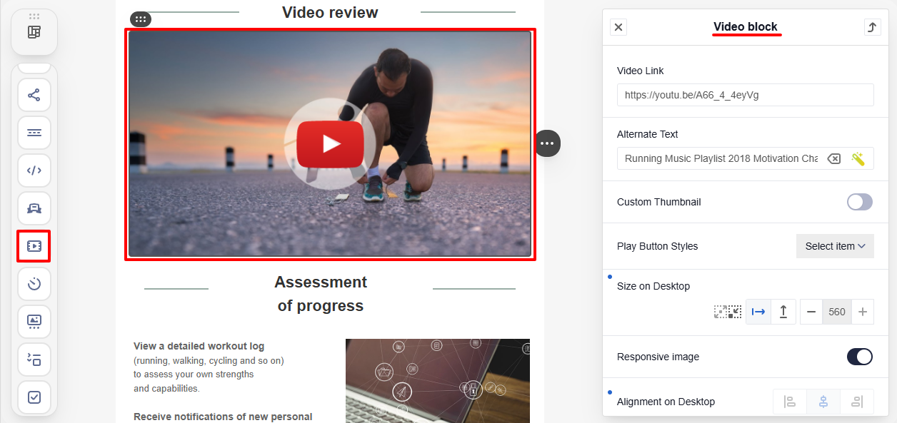
You can add a video link, configure alt text, use a custom preview image and choose the play button style. Set the preview size for desktop in the block settings.
NoteMost email clients do not support video playback in emails. After clicking the play button, the video page will open on the service where it is hosted.
For a video hosted on your own server rather than YouTube, Vimeo, etc., you can embed a native HTML5 player (MP4/WEBM) using an HTML block instead of the Video block. Only a handful of clients (for example, Apple Mail and Outlook for Mac) render inline video, so pair the embedded player with a fallback preview image linking to the hosted video for clients that don't support it.
Timer
AMP Blocks
AMP technology allows you to create emails that look like stand-alone web pages. The subscriber can perform an action directly in the email: view the product range, book a meeting, etc. Instructions for setting up AMP elements:
Columns
The Columns block allows you to populate a two-column frame inside a container or a smart container.
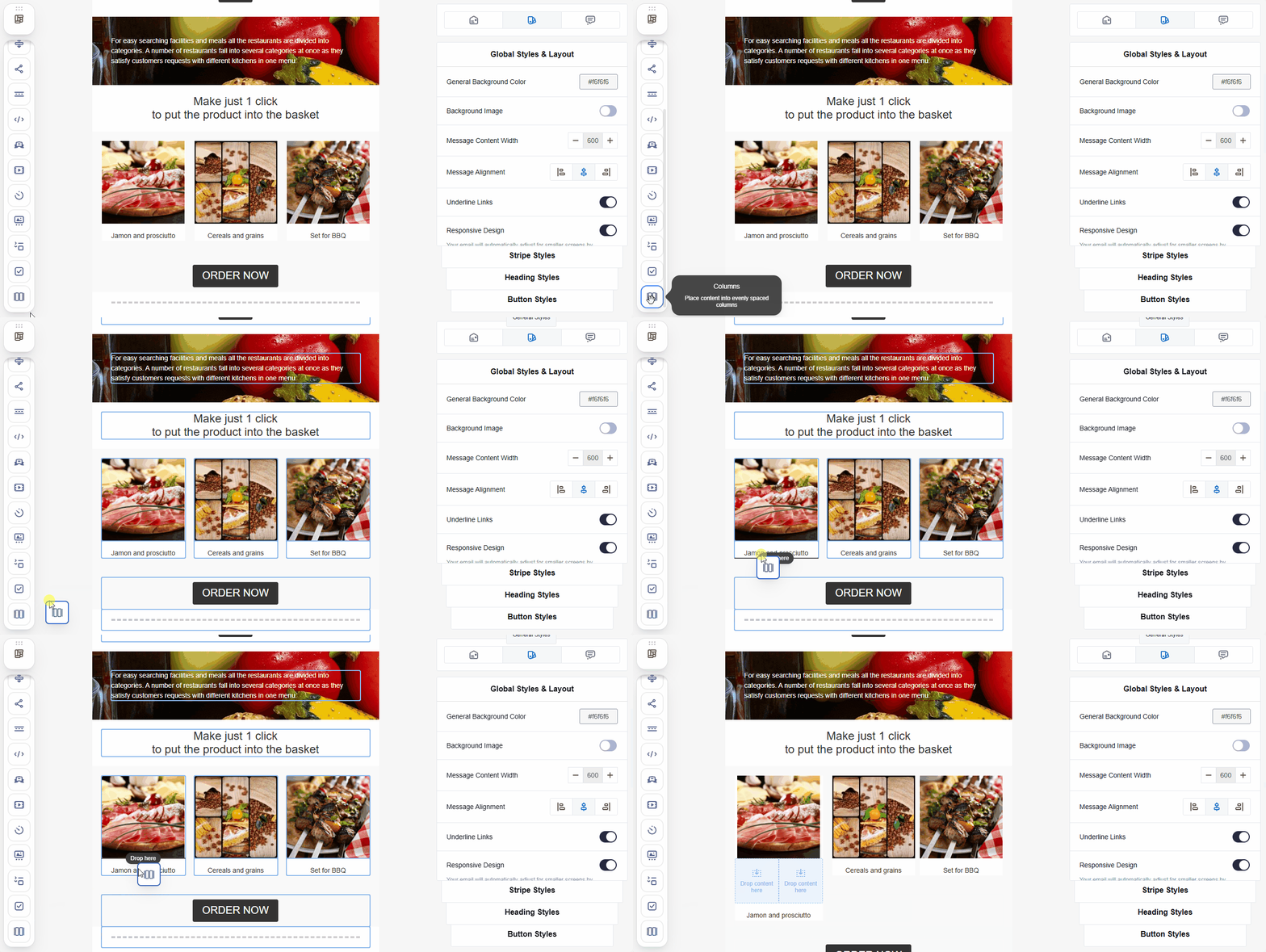
For example, use the block to place the Price and Button blocks horizontally inside the product block.
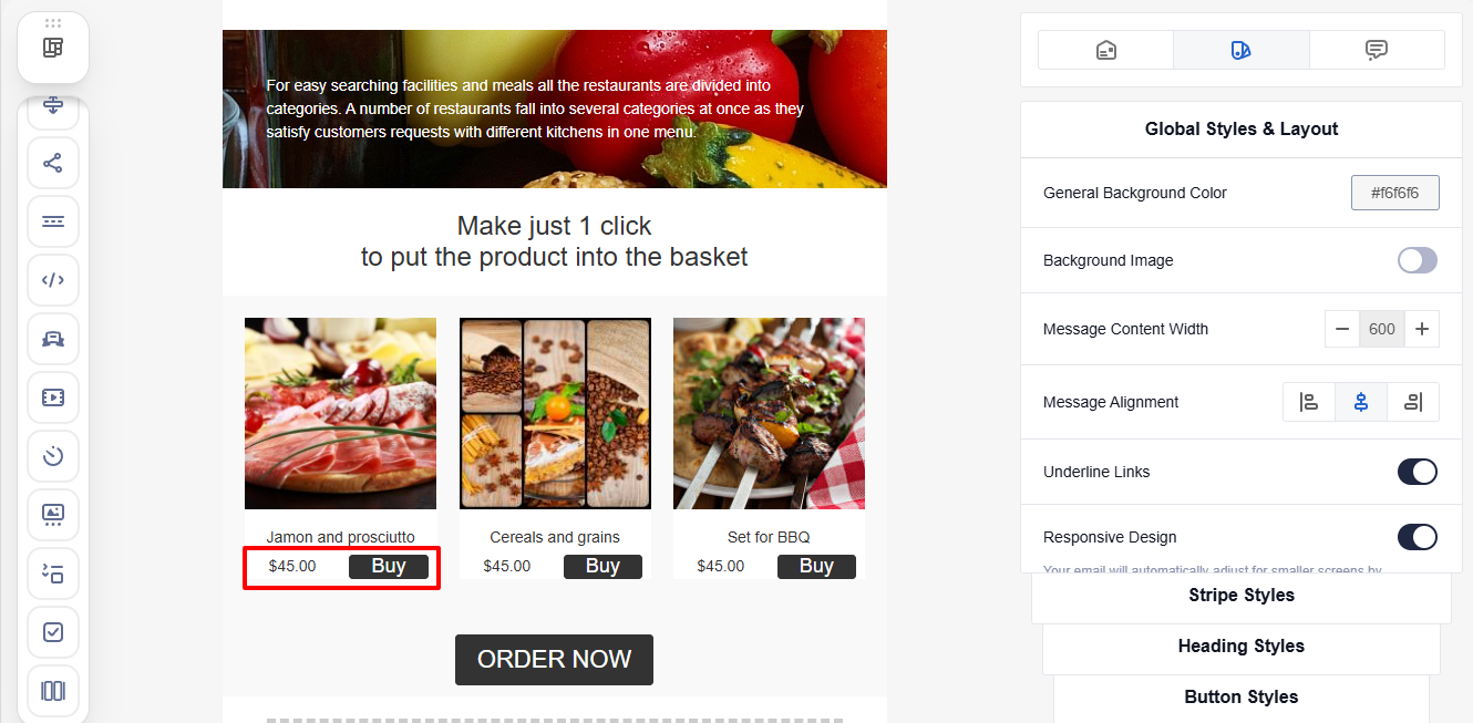
NoteThe columns have equal widths that cannot be changed.
The block contains the following options:
- Background color
- Rounding corners
- Padding
Product Blocks
You can add personalized recommendations to your emails without using code with product blocks, which include:
- Products — displays recommendations,
- Price and Discount for recommended offers,
- Columns — allows you to insert a two-column structure into any container (not just product blocks). The block is described below.
Navigation and Actions with Elements
To select an element, click it in the editor.
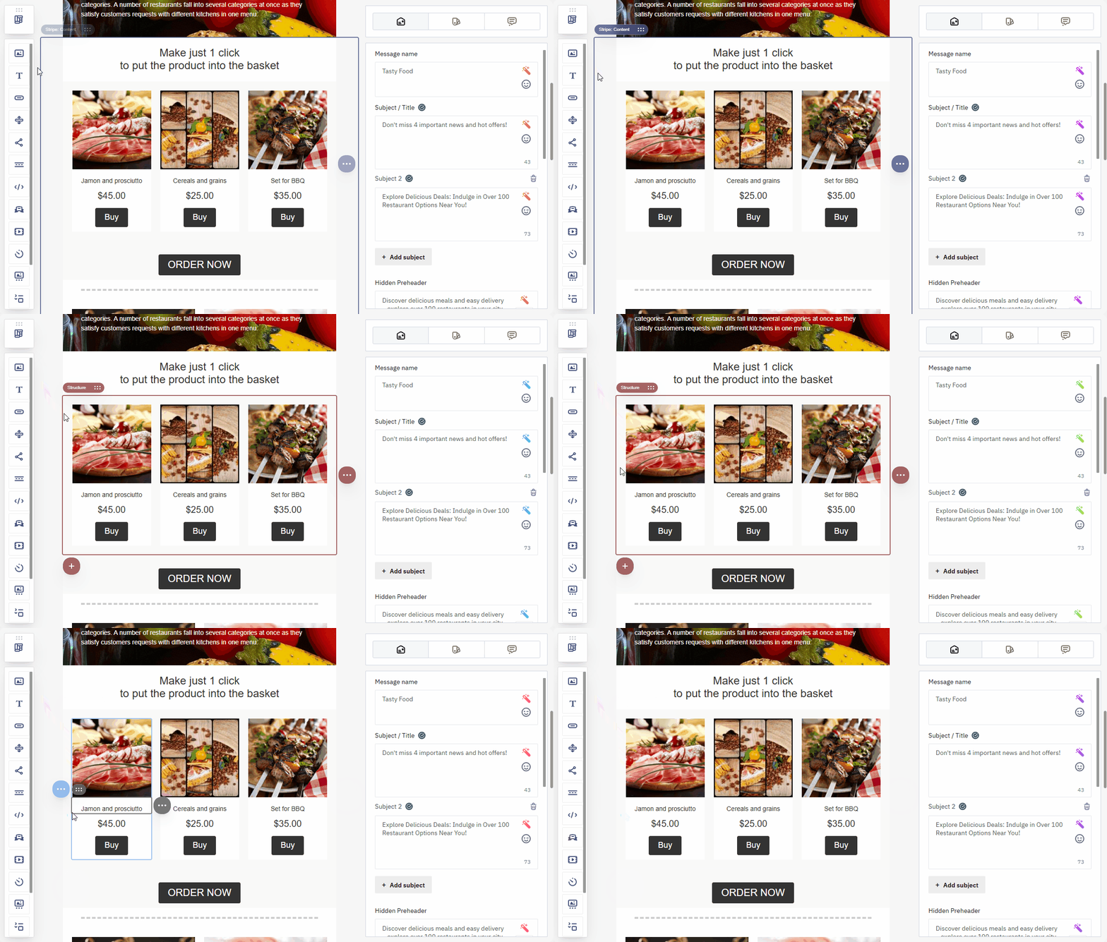
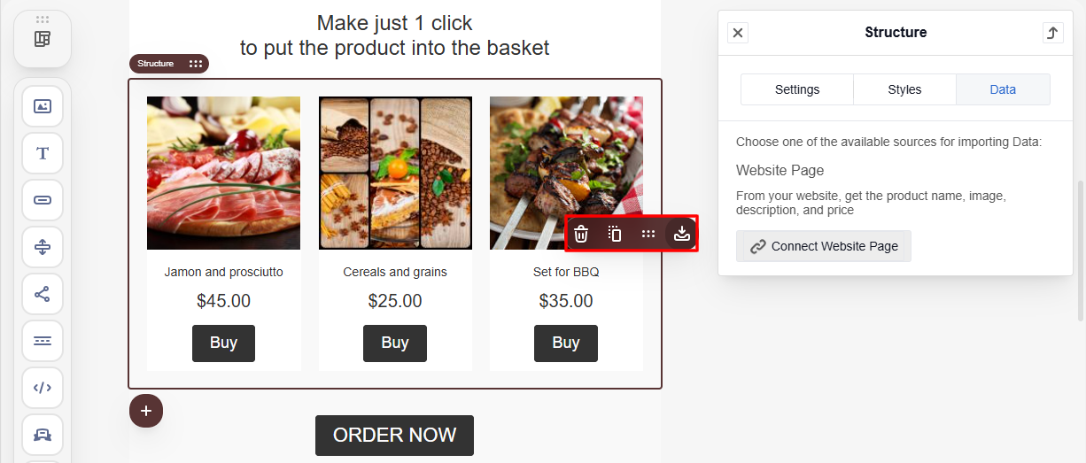
You can perform the following actions with any email element:
- save it as a module (except for Blocks);
- move it;
- duplicate it;
- delete it.
- Hover over the three-dot icon next to the required element.
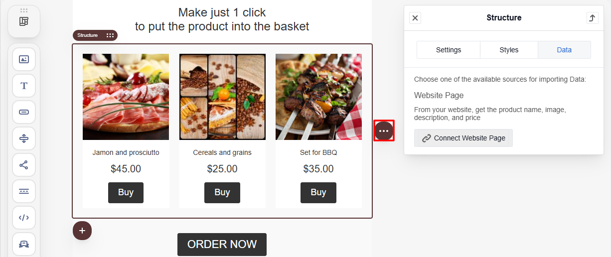
- Select the appropriate option from the context menu.
NoteA smart container has no separate delete action. To clear it instead of removing its blocks (image, text, price, and so on) one by one, select the container level — it appears as a highlighted frame around the whole container — and clear its content. The container itself remains in the template, but empty.
Updated 6 days ago